
Slowly constructing the Jackonomics 2026 US Senate Forecast

Yesterday I had a sudden epiphany and, in the wee hours of the night, wrote a text file describing exactly how I could make a model of the 2026 US Senate elections. This had some errors in it, like how I mysteriously decided to model national polling errors by first averaging the errors for the estimated Republican and Democratic vote shares (???), but it was otherwise pretty solid. I don’t have the original version, but I do have the updated version, which we’ll call Simple Jack’s Election Model Recipe.1 I would paste that in here, but I quickly realized that despite its relative simplicity, the instructions are somewhat arcane. Let me provide the gist. I’ll do this in reverse order, because I realized while reading G. Elliott Morris’s code that it’s easier to understand a model if you start with the simulation and then build the tools used in it. The model uses R, and 99% of the code was written by Claude Opus 4.1 with very specific instructions from me.
We begin with “priors” for each state. Polling data tends to do a poor job of predicting outcomes when the election is many months away, so it’s better to pick some reasonable estimate based on history. I used each state’s previous presidential election result, and messed with some of the states that looked unreasonable.2 These estimates are then updated using whatever polling data is available, but until the last 12 weeks of the campaign, the model heavily relies on the priors, not the polls. Right now, a lot of states haven’t even settled on who their candidates will be, so I only have a few polls on the Ohio race between Jon Husted and Sherrod Brown, who are both very likely to be their party’s nominees.
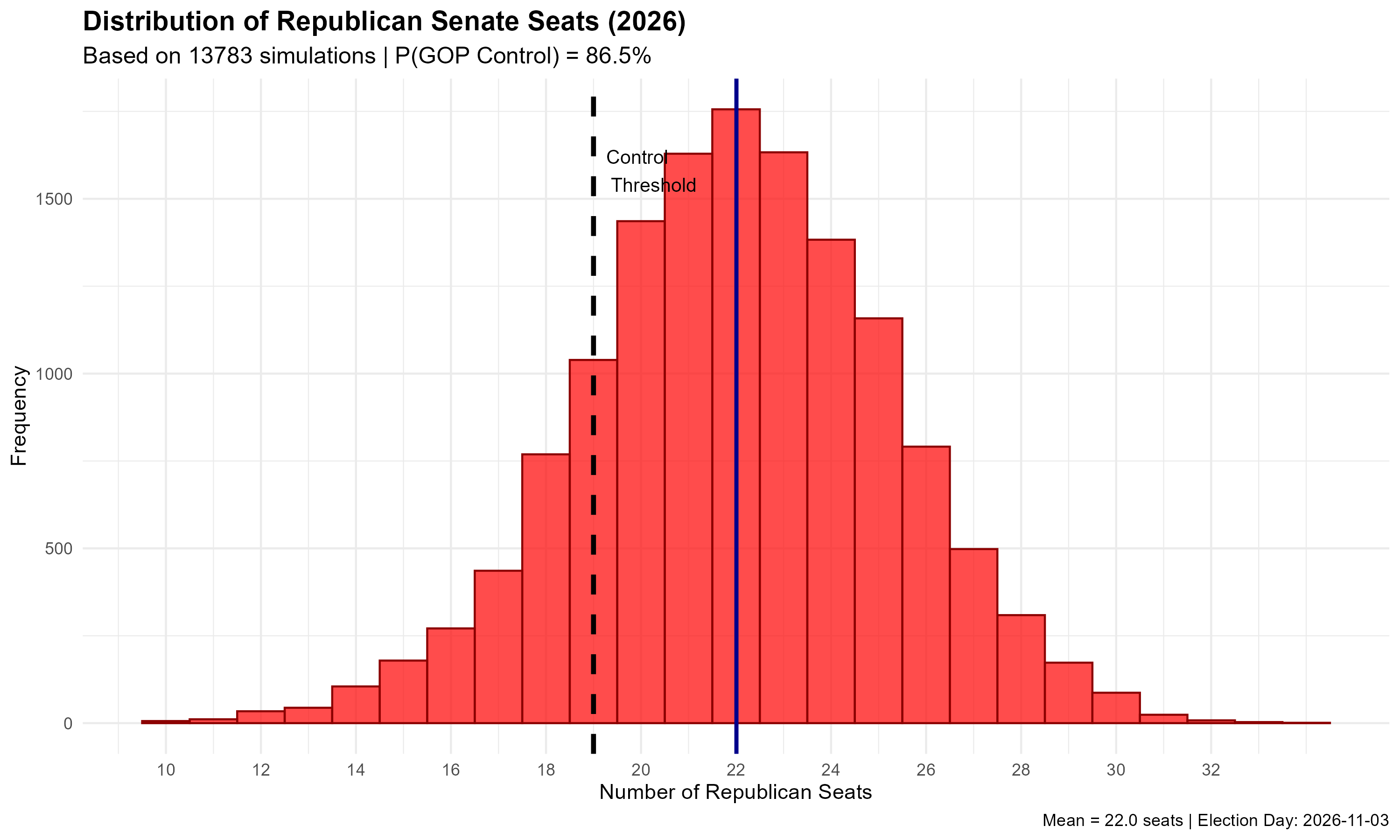
In each simulation of the 2026 US Senate elections, random draws are pulled for national polling errors. There is a national polling error for each Democrat’s vote share and a national polling error for each Republican’s vote share. These are added to their estimated vote shares. Then, random draws are pulled for state-level polling errors, which are applied to Republican and Democratic vote shares in each state. R determines who won in each race, and if Republicans won 19 seats or more out of the 35 up for election, they retain control of the chamber. This is done 10,000 times and summarized in a histogram. Voila: the model expects Republicans to win 22/35 seats and is 86.5% confident that they will retain control of the chamber.
Now it’s time to talk about the tools used for the model. First, where do the random draws for polling errors come from?
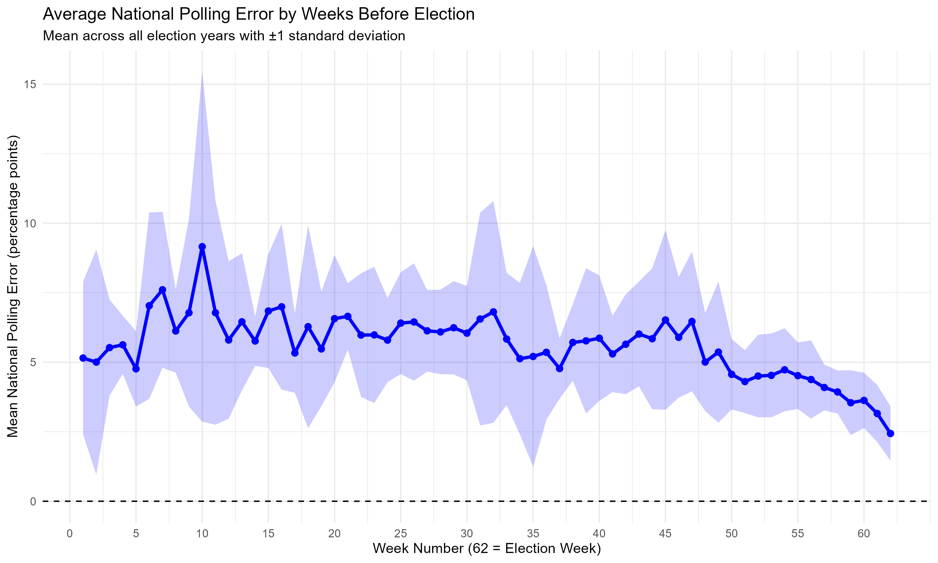
I have a lot of data on polls of US Senate races going back to 2006, and the actual results of those elections. Using that data, I can form weighted polling averages for every one of the 62 weeks preceding election day, and then determine how large the error was for each of those 62 weeks, and for each candidate. For example, the typical poll might have found that the Democrat would receive 45% of the vote, and the actual result was 46%, meaning the error was 1 percentage point. The script calculates national polling errors for each week, too, describing the average difference between what the polling average said the Democrat would get and what they actually got. The same is done for Republicans. This is broken down by week, which is rather silly, but it’s not the worst place to start. Claude often decided to add visualizations, which I deleted from the code, but not without saving the visual said code created. Here’s how the average national polling error evolves over time as election day approaches. Notice how the errors don’t start getting much better until election day is 60 days away.
Once we know what polling errors have been like in the past, we can tell R to estimate the probability distribution functions (PDFs) that best fit those errors. These are ways to describe how frequently errors of different magnitudes occur. Plug in a range of possible polling errors, and the function tells you how likely it is that a polling error in that range will occur. When R estimates these, it looks at the past and creates a kind of line-of-best-fit describing how frequently errors of different sizes occur. Once we have these PDFs, we can tell R to take random draws from them.
To make this easier to understand, think of a six-sided die. Each outcome (1, 2, 3, 4, 5, 6) is assumed to have an equal chance of occurring, 1/6. A probability distribution function for a six-sided die is very simple: P(x) = (1/6)x, where x is the number of outcomes in your range. For example, if you want to know the probability of rolling anything in the range of 2 and 4, plug it in like so: P(3) = (1/6)*3 = 3/6, or 50%. R can make similar functions for polling errors based on historical results. Once we have those functions, we can use them to calculate random polling errors in simulations. The nice feature of this is that these polling errors are empirical—we aren’t guessing how often the polls will be wrong based on theoretical assumptions.
Below, you can see a graphic Claude decided the R script should generate, describing the PDFs for Democratic and Republican polling errors at different points in the campaign. Week 62 is the final week.
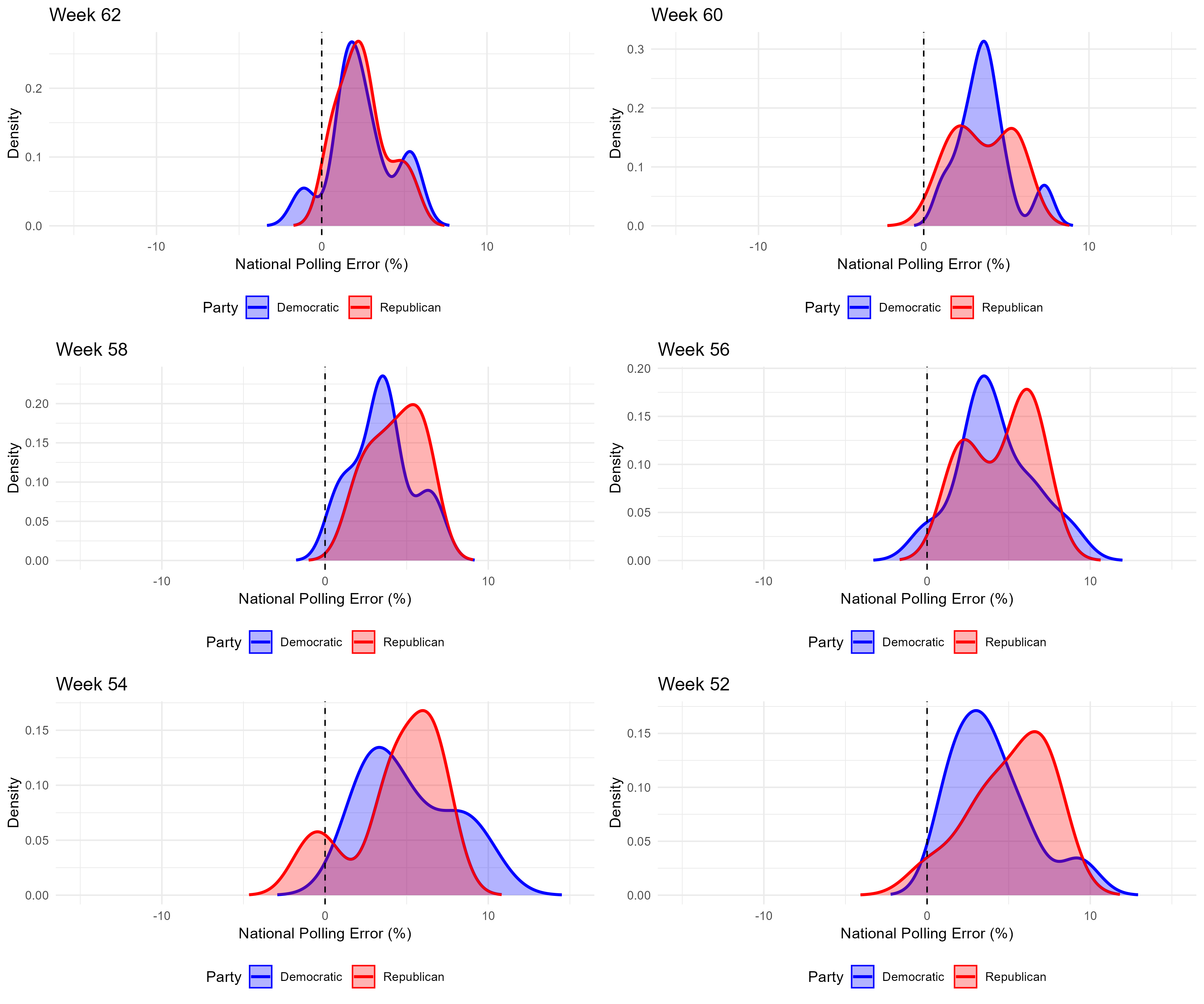
There are a few things you should notice. First, the typical polling error is positive. This is rather counterintuitive (why would vote shares always be underestimated?) but it’s because we’re working with pure polling averages. Polls almost always include undecided voters, who tend to evenly split between the two candidates, adding to both of their vote shares. Hence, the typical polling error is positive. The second thing you should notice is that polling errors become more concentrated around a smaller range of values as election day approaches. The distributions in the week 52 graph are wider than those in the week 62 graph. Finally, because I estimated these distributions for every week, there are a lot of funny features created by random chance, like the multiple peaks you can see in each distribution. I’ll be updating the model to not have this funny feature.
One final graphic: how does the probability that the Republican candidate wins relate to their share of the vote in the polls? Here’s a visual description.
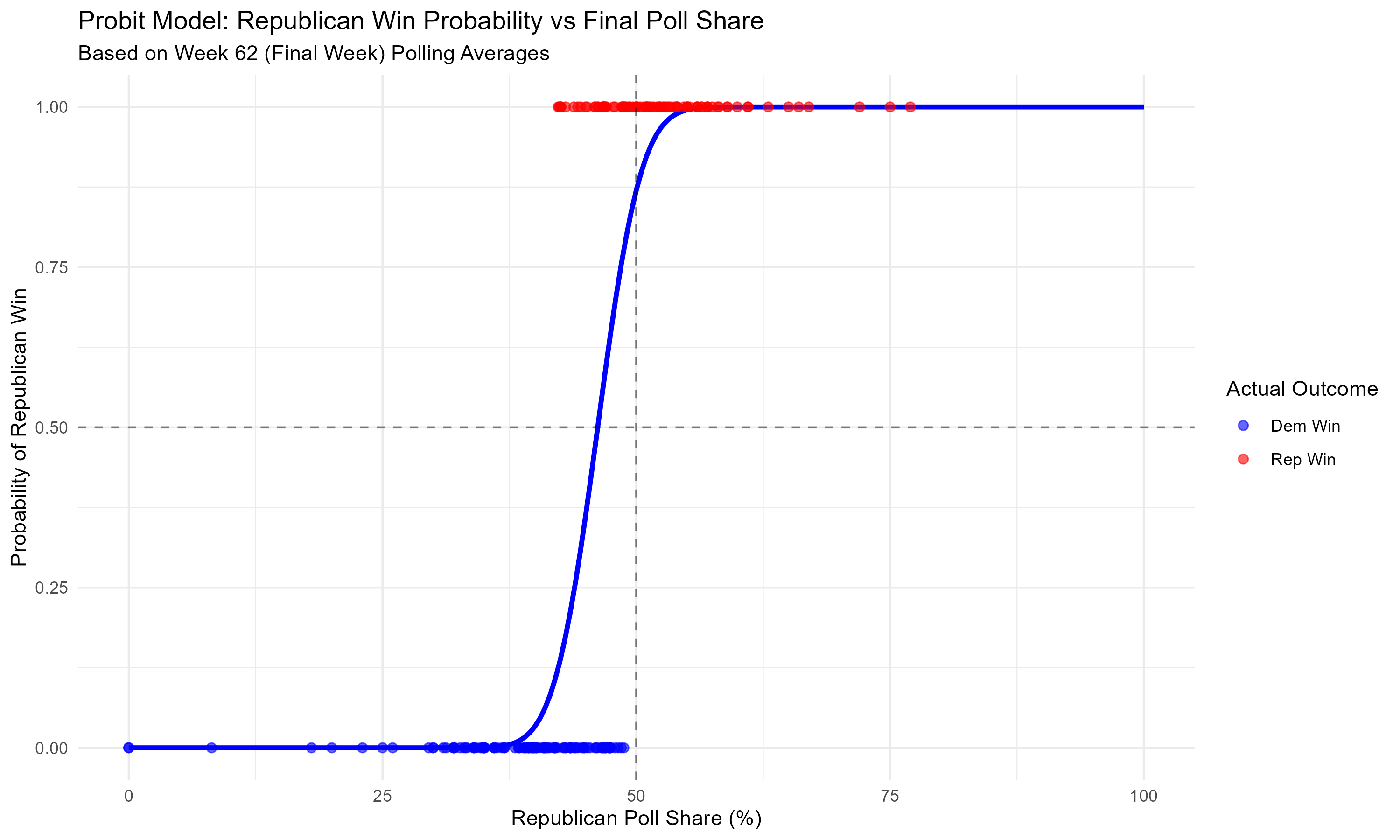
The horizontal axis is the Republican candidate’s share in the polls in the last week of the campaign. The vertical axis is the probability that they’ll win. The blue line describes the relationship between the two. Notice how their odds of winning are essentially zero if their support is below 37.5%, and quickly rise after that point. If you’re having trouble reading the graph, just pick a point on the bottom describing the Republican’s share in the polls, and let your eyes move upwards until they hit the blue line. That’s the probability the Republican wins given they have that share of the vote in the polls. Finally, the dots are actual race outcomes: a dot appears on the bottom as a blue dot if the Democrat won and on the top as a red dot if the Republican won.
Now, the difference between Claude and I is that Claude is only smart enough to generate that probit model and graphic, while I have a Big Brain, so I know that what you really want to use is the Republican’s lead in the polls, not their share. There’s a difference between having 45% of the vote while the Democrat has 40% and having 45% of the vote while the Democrat has 50%. So, here’s a graph of such a probit model:
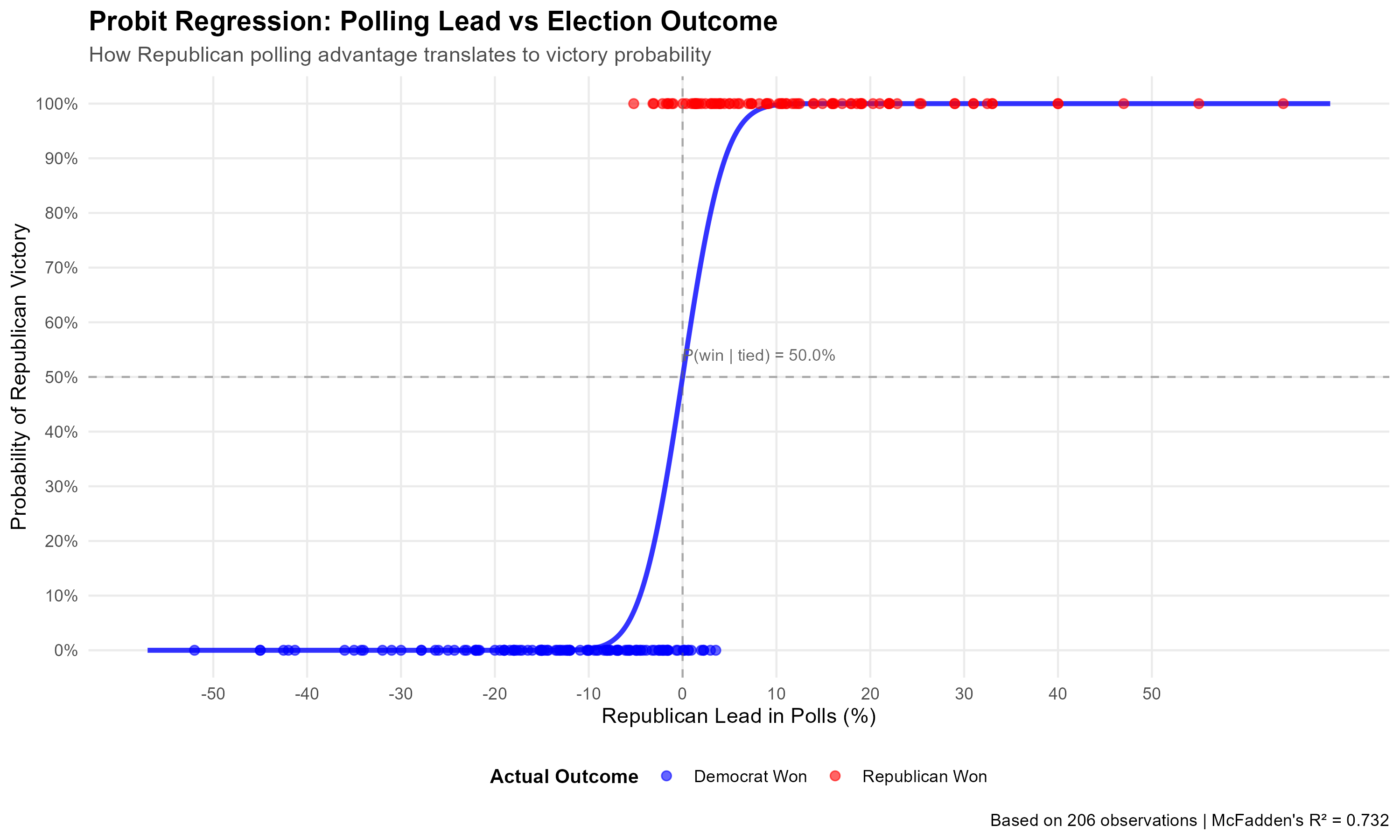
Beautiful. In our sample, the model estimates that the probability a Republican wins a Senate race given that the polls are tied is exactly 50%. In a previous version I got 44.9%, and as it turns out this was caused by a weird outlier case where a Republican seemed to have lost despite a > 20 point lead in the polls. This was the Maine 2024 US Senate race, which had been webscraped incorrectly due to the presence of 4 candidates. I was under the incorrect impression that Alaska was the only state with this problem, but it seems the Pine Tree State has to be a huge pine in my ass sometimes.
There are many further improvements to be made, but the story is clear: Republicans are very likely to keep the Senate next year, and Claude can make some pretty nice graphs.
Apparently disability rights groups were really upset when Ben Stiller depicted this character in Tropic Thunder, even though it was a jab at how actors were willing to do anything (including horrendous depictions of disabled people) to win an award. Have I mentioned that I’m not always a fan of disability rights advocates?
This part of the model is more art than science as things stand, but I’m working on it.