


Let's Do The Living-Standards Shuffle
Burger income has fallen. Billions will starve.

Bernie Sanders recently tweeted that American wages have fallen when adjusted for inflation, so now it’s time to restart economists’ least favorite conversation: have living standards risen in the US? This time, let’s make it interesting.
Normally, we look at changes in the typical person’s living standards using the real median personal income. As a refresher, the median income is the income you get when you line everyone up in order of income and ask the person in the middle how much they make.1 To get the real income, we use an index of prices, in this case, the CPI-U-RS index. This combines the prices of goods and services into a single number, weighting them by their share of spending. So if the typical price doubled while incomes quadrupled, real incomes doubled. Here’s how this looks in practice.
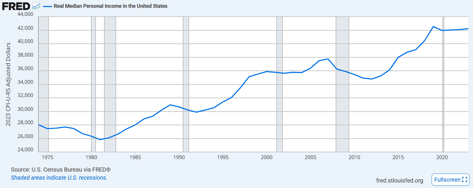
Problem solved. Sanders, and for that matter, any populist talking about the (material) decline of America, is a liar.
But what if you want to know for sure that this isn’t bullshit? After all, this graph takes income data and divides it by a price index. I bet these eCONomists are scamming us with this price index they transparently report the methodology for in every macroeconomics textbook, and online.
Sarcastic remarks aside, let’s start with the McDonald’s menu. Here’s one supposedly from 1975, if this Facebook user isn’t lying.

Now here’s a modern McDonald’s menu:
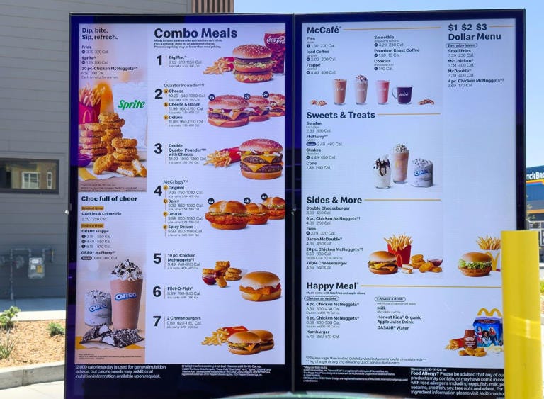
Clearly, prices are higher than they used to be, just like how income is higher. Now, let’s focus narrowly on the price of a quarter-pounder with cheese. We have data on the nominal median personal income. This tells us that in 1975, the typical person could buy 8,091 quarter-pounders with cheese in a year.2 In 2023, using the price shown in the menu above, they could buy 4,103. Our quarter-pounder living standards have fallen by 50.7%!
I was slightly incredulous when I saw the price of $10.29. I checked, and the price on DoorDash for a McDonald’s near me was a much lower $6.19, yielding 6,821 burgers per year. It seems that this random menu photo is from a pricier McDonald’s, but our new price still yields lower real burger income. For real burger income to have stayed the same, we’d need either a median income of $50k or a price of $5.22. But this is still a tad pessimistic, because McDonald’s has improved in quality since the 1970s. For example, the quarter pounder with cheese uses a slightly larger 4.25 oz patty rather than the old 4 oz patty.
How about the price of housing? After all, we spend more on housing than anything else. I could use a home price index, but let’s make this very transparent and instead use a random example of a house sold way back when. /u/sowhat4 reports that they bought a new house in 1968 for $27,500. It had “One commercial acre, four bedrooms, three full baths and walled back yard. 2600 square feet.”
Our income dataset doesn’t go back that far, so let’s try the median family income, which was $8,632 in 1968. This user actually reports that their income was $13,000 “between the two of us” that year, so clearly they were unusually wealthy, though perhaps not unusually wealthy for a white family. (Mind you, segregation had only ended four years before, in 1964!)
So, we have a 2600 square foot house purchased for 318.6% of the typical family income at the time. Thankfully, this user has told us exactly how much this home costs today: $578,000. Using the same income data, that’s 573% of the typical family income today. Unsurprisingly, it looks like American income does not buy as much housing today as it used to.
But this is only one data point. Unlike the McDonald’s menu, homes are not standardized and sold for the same price all around the country. Worse, the typical family size fluctuates over time, so our income data is a bit distorted.3
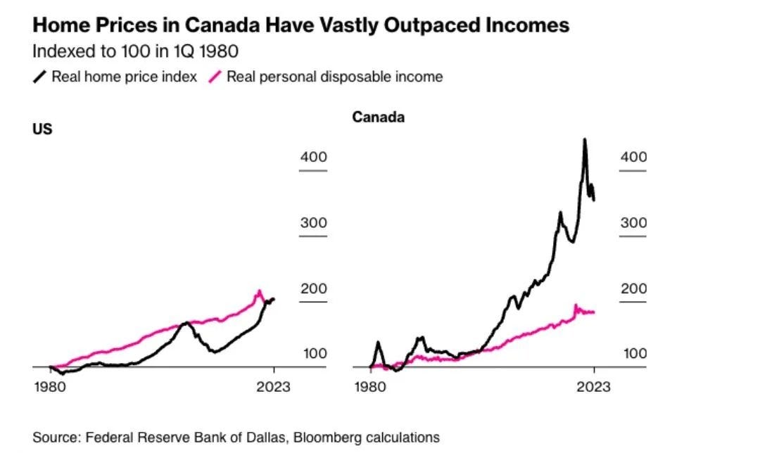
Summarizing the cost of housing is hard. We might try to look at the median sales price of a 2000 square foot home over time, and see that it’s risen faster than the median income. Troublingly, this could be because more people decided to live in areas that were always more expensive, like cities. Here’s one attempt to measure home prices by Bloomberg, comparing the US to Canada:
How about a bright spot: TVs! An ad posted on Facebook shows a 25-inch color television set sold for $500. The typical person made just $5,664 in a year, so they could buy just 11 of these. Today, you can buy a 25-inch smart TV of far superior quality on Amazon for just $119. The typical person (including those not working full time) made $42,220 in 2023, so they could buy almost 355 of these!
So while burger income has fallen 15.7%, home income has stagnated, and TV income has skyrocketed by a whopping 3,227%, and that’s comparing completely different products! Entertainment is incredibly easy to get today. From what I’ve seen, it’s a similar story for other manufactured goods.
How about gas? If we’re using the price of gas in 1975, this is going to be a bit misleading, because 1973 is when OPEC decided to choke the supply of oil and raise prices. Nevertheless, let’s use this quoted figure for gas ($0.36/gallon) and compare to today. This user also decided to use average income and cited a figure of $9,400. I have no idea where this number came from. If you use personal income per capita, we didn’t hit $9,400 until the end of the 1970s, and the 1975 figure was $6,340. If you use real (i.e., inflation-adjusted) GDP per capita, real incomes were always higher than $9,400 in the 1970s, and came in at $27,690 in 1975.
But fuck it, let’s use their figure for income to get a real gasoline income figure of 26,111 gallons. Today, using the personal income per capita figure of $72,429 in 2024 and the 2024 gas price of $3.61/gallon, real gasoline income has fallen to 20,063 gallons. Bad, but not the worst, especially given that electric cars are much easier to come by in 2024 than in 1975.
There were a bunch of other prices cited in that made-up image on /r/bitcoin, so let’s put their real income figures into a table. Again, we’ll use personal income figures of $9,400 and $72,429. Remember, the real income figures used here simply tell you how much of something the typical person can buy. So, for example, the first row tells you the average person could buy 2.72 new cars in 1975 with a year of income.
It looks like car and movie income are down a bit, with postage and sugar income down significantly. But milk and coffee income have risen dramatically, with the amount of coffee you can buy more than doubling. Egg and bread income, likewise, have risen significantly.
There are a lot of caveats here. Most obviously, using average income figures is misleading because they’re skewed by inequality. As we’ll see in a moment, median income has still grown.
Another problem is that new cars are way better than they used to be. According to one source, the typical miles per gallon for a car is up about 68% from 1975 to 2017. The car I used for the modern car income calculation, the Toyota 2025 RAV4, has an mpg of about 30, depending on whether you’re driving on whether you’re driving in a city or on the highway. In 1975, the typical MPG on a car was 13.5, according to that source I linked, and it was typically 22 in 2017. Depending on the new car you use, the MPG in 1975 might be higher, but there have definitely been substantial improvements.
Most importantly, the fact that we’re not using a price index is a bad thing, not a good thing, because it leaves us vulnerable to exceptional anecdotes. Maybe the cited price of bread in 1975 was unusually high, resulting in an overestimate of bread income growth. We’re also relying on some random Redditor posting on /r/bitcoin to tell us about the world of the 1970s. I did this deliberately because if anything, this makes the picture excessively pessimistic, because /r/bitcoin users are generally fans of the narrative of American decline. I mean to argue that real incomes have clearly risen, so this more pessimistic picture helps my point, given the direction of bias makes the estimates I gave look worse than they really are.
So let’s look at some other goods in a more rigorous way:

I manually added some labels on the right after screenshotting this one. The blue line gives you the median household income in the US. Below it, income is deflated by price indices for various goods, so we don’t have to worry so much about anecdotal evidence.
We can see that apparel income has risen greatly, almost as much as nominal income, since the price of clothing hasn’t gone up nearly as much as prices in the rest of the economy. Unlike our previous finding, car income has risen. This uses prices for used cars rather than new ones, but that shouldn’t change the picture too much, since the used cars of today are always the new cars of yesterday. Electricity income has also risen. There’s also a line for the real median household income, which uses the CPI price index to adjust for inflation.
We’ve also replicated our previous finding that theater income has stagnated, although in this case we only have data going back to 1999. Housing income has fallen by a lot. Problematically, the data being used here is the median sales price of houses sold, and the typical house sold today is much larger than the typical house of the past. That means we’ve overestimated the decline in housing income.
Here’s an article citing the US Census Bureau to describe the median home size. In 1980, it was 1,595 square feet, while in 2018, it was 2,386, an increase of 49.5%. Using median family income4 and the median sales price data from FRED, the typical family could buy about 0.33 homes with a year’s income in 1980, or 526 square feet. In 2018, the typical family could buy 0.237 homes with a year’s income, or 565 square feet. So in truth, even real home income has risen! You just have to buy the same size home your grandparents lived in, which most people don’t want to do.
Without a doubt, the typical American today is much wealthier than the typical American in the past. Even before adjusting for quality, we often find that people can buy more than they used to be able to. If you really want to live like your grandparents did, you can! At least when it comes to the material things you pay for. But to do this, you’d have to accept the standard of living your grandparents lived with. That means inefficient and slow cars, smaller homes, and smaller burgers.
Despite the many forms of material abundance Americans live with, they are not getting any happier. By the measure of one series of surveys, Americans were about 18% less happy in 2018 than in 1975. It feels easy for me to explain my own personal problems that exist despite the income I have access to through my family: I’m too anxious to make connections and have sex, and I’m too sedentary. But it’s difficult to provide an explanation for why the same thing can be observed for Americans in general.5
I believe Senator Sanders and others like him are good people. But they should learn to focus their thinking on the question of why Americans are miserable in spite of, not because of, changes in their wealth.
For example, the median in the set {1, 6, 100} is 6.
You wouldn’t actually do this because you need to pay for other things, like housing. Obviously.
I checked, and the median family income has grown slightly faster than the median personal income from 2003 to 2023.
Household income cuts off at 1984.
That source I linked might help.