
Economics Is a Science, Part 2
An Introduction to Econometrics

One way someone can become more partial to the idea that economics is scientific is by studying the field themselves. But many of the lessons provided by doing so will feel less like science and more like narratives that fit the world well. This is not so bad, but will feel unconvincing at times.
Consider, for example, the case of gasoline sales during a hurricane. Typically, the price goes up by a lot. A common story one can tell in this situation sounds like this: “This is pure greed. Gas stations are happy to overcharge for oil when they know people can’t refuse.” Compare this story to the one economists tell: “During a hurricane, it becomes very difficult to truck in additional gasoline. Gas stations need to pay drivers more money to cope with the dangers. Without charging a higher price, a gas station would be unwilling to supply much gasoline at all, especially given the risks to the owner themselves.”
The point is not that the economists are right, but that much of economics feels like storytelling, and where there is only storytelling, our emotions guide us, which is no good for science. Economists improve on this situation by formalizing their stories with models like supply and demand. Here is a graph that tells the same story as the one above.

Here, there’s a shortage of gas. Gasoline suppliers can cover their additional costs if they can charge the hurricane price, and only slightly less than the normal quantity is supplied. Impose a price control, and they’re unwilling to supply so much, and a larger shortage of gas occurs.
Yet we are still telling a story. It matches reality well, and we could provide more evidence to show this. But we’d like to get much closer to what’s going on in the real world. Rather than observing what happens and explaining it after the fact with a story, it would be ideal if we could compare the behavior of gas stations and other firms in the same circumstance when they’re exposed to different policies—one group faces a price control, while the other doesn’t. In other words, it would be good if we had a control group, like when drugs are tested. It would be especially good if we could identify the supply and demand curves explicitly. (As it happens, Vernon Smith did this with a controlled experiment and won the economics Nobel for it. But we’ll see a way to do this “quasi-experimentally” with real-world observations.)
To do this, we’ll need the help of econometrics. If you want a more scientific flavor to economics, econometrics is your best friend. Practically every important paper in economics contains econometric work, so you won’t even be able to understand the work of most economists without it.
Simply put, econometrics is the application of statistics to economics. In this section, we’ll look at some of the most important statistical methods economists use, and we’ll use them to address seven interesting questions:
Does smoking cause lung cancer?
Does it pay to have a high college GPA?
Does immigration decrease American wages?
Does the minimum wage cause unemployment?
Do alcohol taxes reduce deaths from drunk driving?
Does it pay to be an economics major?
Who will win the 2026 US House of Representatives Elections?
The techniques we’ll be using often rely on random samples to be valid. The prediction that smoking causes lung cancer, which we’ll be investigating, is not based on economic models, of course, but it’s both interesting and useful for demonstrating how linear regressions work.
Many economists would be well-served by calling themselves econometricians. While economics is often imagined to be a very theoretical field with lots of models and mathematics, most economics papers published nowadays center on econometric evidence that checks the accuracy of a model. But before getting into this section, I should give you a reason to bother with any of this. If you really don’t want to, you can wait for the next part, which will focus more on the philosophy of science, and that’s where the real meat is. I originally planned to publish that part as part 2, but this is good background information for the ideas described there.
Finally, before beginning, know that I have edited this post repeatedly and I am unlikely to fix all of the flaws if I did that again. Even Michelangelo’s David is missing a muscle.
Part 0: What is omitted variable bias, how serious is it, and what other forms of bias are there?
I’ve talked about omitted variable bias on this blog before, and I think it can be considered one of, if not the, most important problems in science. Before proceeding, remember that “correlation” refers to when two variables (measurable features of the world like income) tend to coincide. Sunshine is correlated with flower growth, for example, since more sunshine tends to occur when more flowers are blooming. We have to do more work to show that sunshine causes flower growth, and omitted variable bias is one reason why.
An omitted variable is one we are not including in a model of the world. We might make a model that predicts piano performance using time spent practicing, and an omitted variable here would be the working memory of the player. Omitted variable bias would occur if this variable affects piano performance and is correlated with practice time. If the people who practice a lot also tend to have really good working memory, they would be better at piano even with the same practice time as everyone else. So if we estimate what effect practice time has on performance using only data on practice time and performance, we’ll overestimate the effect of practice time.
In general, omitted variable bias occurs when outcome A and independent variable B are correlated and appear causally related, but another variable, C, is correlated with B and has a causal relationship with A. There are numerous examples of this. Majoring in economics is correlated with income, but does majoring in economics really cause you to earn more? Maybe people who major in economics just happen to be rich and well-connected. As you’ll see later, we have evidence this isn’t the case.
This is a really big problem when talking about politics. Once you understand it, you’ll see it everywhere, and you’ll probably start thinking you’re smarter than everyone, like me.1 To give an example, many people are quick to attribute economic growth or decline to a president and their actions. Hoover is blamed for the Great Depression, while Trump’s tax cuts are sometimes credited with the strong growth preceding the pandemic. Yet economists blame the Federal Reserve, not Hoover, for the Depression, and the tax cuts and growth might have happened anyway even without Trump. In the first case, the source of bias is the Federal Reserve, which coincidentally kept the money supply too small, coupled with a stock market crash and the Dust Bowl. In the second case, the fiscal position of the United States and the interests of the electorate might be confounders.2 If tax cuts appear affordable through a greater deficit and American voters want free money, any Republican politician will be incentivized to provide them, just as Bush and Reagan did. But this point is more speculative than the first one.
Unfortunately, there is no reasonable way to answer the question of how common omitted variable bias is, other than looking at examples. We can’t randomly sample all causal questions, because there are an infinite number of them, so we could never identify their “population”, or the collection of every pair of things A and B where it seems like A causes B. We can only look at the issues that happen to catch our eye.
Here I’ll explain four other forms of bias: two-way causation, attenuation bias, selection bias, sampling bias, and simultaneity bias. This is not an exhaustive list of potential sources of bias, but each is important in econometrics.
Two-way causation biases your results when the outcome affects the independent variable you’re interested in the effects of. For example, exercise might affect well-being, but well-being might affect the amount of exercise. This is solved by many of the same methods applied to omitted variable bias.
Attenuation bias occurs when there are errors in the measurement of the independent variable. The more errors, the more the estimated effect is attenuated toward zero. (Think: if you made large, random errors in your measurement of sunlight, would it still look like it’s related to flower growth?) This is not necessarily solved by the same methods used for the previous two forms of bias. If you want to eliminate attenuation bias, get better data.
Selection bias is bias in the way a treatment is assigned. For example, the people we’re measuring might self-select into the treatment in a way that relates to the outcome. Think of a new program that a teacher introduces to help students do better on tests. People self-select into the program, and what do you know, they do better than the people who don’t! Unfortunately, this might only appear to work because the people who choose programs like this tend to care more about studying anyway, or have pre-existing general intelligence.
A similar form of bias is sampling bias, where some people are more likely to appear in our sample than they are in the general population. A funny example is provided by Wikipedia: try handing out a survey asking if people like responding to surveys, and they’ll overwhelmingly say yes. In our previous example, sampling bias would occur if we wanted to know whether this new program helps people rather than just current students, who could be unusually responsive to help. Maybe there are more people in the general population than in the student body who don’t benefit from help. One way to describe the difference between this form of bias and selection bias is that selection bias violates “internal validity” (whether our results are informative about the people we’re studying) while sampling bias violates “external validity” (whether our results are informative about the people outside our sample).3
Simultaneity bias is especially important in econometrics, compared to other fields. Recall how both supply and demand determine the price and quantity we see in a market. If we observe price and quantity over and over again, we might see a positive relationship between the two. We might draw a line through these points and call it a day—there’s our supply curve! It has a positive relationship between price and quantity, after all, which is the essential characteristic. But prices and quantities are determined by both supply and demand, so what we’re observing might not really be the supply curve. It would only be the supply curve if we knew the supply curve has not moved during our observations.
I mentioned just a moment ago that we can identify supply and demand curves in the real world. This can be done with the method of instrumental variables, described later, though our example does not focus on supply and demand. The important thing is that a solution exists. I once encountered someone who pointed out that supply and demand curves can’t be determined from the price and quantity we observe in a market. This is correct, but the conclusion that you can never find supply and demand curves is not.4
Part 1: Does smoking cause lung cancer?
In practice, econometrics is all about regression techniques, which produce lines of best fit. (You’ll get a visual in a moment.) These lines are one way to describe the relationship between two variables.
We want to know the relationship between the rate at which people in a country smoke and the rate at which they are diagnosed with lung cancer. For that, we need data: a list of countries with their rates of smoking and lung cancer. Once we have that, we can get to work with our essential tool: the simple linear regression model.
lung_canceri = β₀ + β₁*smokingi + ei
This probably looks scary to you, but don’t worry. It won’t take long to understand. β₀ is what we call a constant term, β₁ is the coefficient on smoking, and e is the error term.
Here you should think of β₀ as the rate of lung cancer in a country where nobody smokes, meaning “smoking” is equal to zero, so β₁ does not affect the rate of lung cancer. β₁ is what we really care about. Simply put, it’s the effect of the smoking rate on the lung cancer rate. If we measure smoking with the number of people out of every 100,000 who smoke, and lung cancer likewise, then β₁ tells you the increase in annual lung cancer cases per 100,000 people associated with one extra person smoking out of every 100,000.
The little “i” just means the thing it’s attached to varies with the entity we’re looking at, in this case a country. Econometricians usually say entity, but you can think of the i as standing for individual to remember this easily. Any given country has their own equation. Here it is for the United States:
31.9 = β₀ + β₁*23,000 + ei
Those β variables could only be acquired if we had data on the entire population of every country, so I can’t write them explicitly. Even the numbers I included are just estimates at the end of the day. In any case, if you wanted to refer to the rates of smoking and lung cancer in the United States without knowing them, you could describe the US as entity 1 and write
lung_cancer1 = β₀ + β₁*smoking1 + e1
Notice the change to a 1 in the subscript. Finally, e is what econometricians call the error term, but you should think of e as standing for “everything else.” We can get an estimate of the rate of lung cancer using the smoking rate. But if the equation is going to describe the true relationship, we need to include everything else, because you would need more than a country’s smoking rate to determine their lung cancer rate with certainty. For example, one thing included in “e” is air pollution, which we would expect to cause lung cancer even if nobody smokes.
I’ll take a moment here to show exactly what the variables are, since that still may not be clear to you. Let’s say we have estimates for the βs, giving us this equation:
lung_canceri = 100 + 0.1*smokingi + ei
If your country has a smoking rate of 50 users for every 100k people, we can replace “smokingi” with 50 and then simplify to estimate the rate of lung cancer.
lung_canceri = 100 + 0.1*50 + ei
lung_canceri = 100 + 5 + ei
lung_canceri = 105 + ei
The estimated lung cancer rate is 105 cases for every 100k people. Notice that if we assumed nobody was smoking, we would still have a 100 in the formula, and that would be our estimate for the number of lung cancer cases for every 100k people. There’s also still an error term, ei. If the real lung cancer rate was 110 case for every 100k people, the difference with our estimate would be 110 - 105 = 5, our error.
Now let’s find our line! Using data on tobacco usage rates in 2020 from Our World in Data and data on lung cancer rates in 2022 from World Population Review, you can create a plot in Excel and estimate a simple linear regression. I’ve included such a plot below.

The line of best fit is
lung_cancer = 1.8719 + 0.0007*smoking
For example, if I told you the tobacco usage rate in the United States is 23,000 per 100,000 people, you could estimate that the rate of lung cancer is 0.0007*23,000 + 1.8719 = 18 cases per 100,000 people. The real rate is 23. Not bad! However, you can tell just from the image that you’ll see large errors when estimating the rate in some countries. The country on the far right in the image is Myanmar, where we expect a much higher lung cancer rate than what we observe, though we still do observe a much higher one than observed in the cluster of countries on the bottom left.
More importantly, we’ve just replicated a consistent result found by statisticians: places where tobacco usage is more common also have higher rates of lung cancer. You may think this is a silly way to figure it out, and prefer to be shown experiments. But those are somewhat impractical and potentially unethical. Even with their consent, can you randomly assign a potentially deadly habit to people and follow them for the rest of their lives?
If the history of cancer told by Siddhartha Mukherjee in The Emperor of All Maladies is to be believed, scientists originally showed the terrible consequences of smoking and other inhalants on human health using statistics. Chimney sweeps, like smokers, were also more likely to die of lung cancer. Our knowledge of something life-changing and important began with work like the simple regression I estimated for this essay. If you admit epidemiology provides useful knowledge about the world, you’re often going to have to say the same about economics. The human body and its interaction with disease is certainly of comparable complexity to the economy, and epidemiologists apply statistical methods just as vulnerable to omitted variable bias and other issues like measurement error.
A Mathematical Interlude: Ordinary Least Squares
Before finding a solution to this problem, I’d like to pull back the curtain on what this “line of best fit” really is. You should skip this interlude if you really don’t like math, but I encourage you to read it, because I wrote it to be understandable to anyone who only knows basic algebra. This part shows you that regressions used by econometricians aren’t magic. It would be hard to depend on them without knowing that there is reasonable mathematics behind the veil.
Simple linear regression is performed using a technique called “ordinary least squares” or OLS. (We can also do it with the “method of moments”, but this one is more intuitive.) Let’s say we’re only looking at two countries: China and the United States. Then we only have two data points. We can simplify how we write them by using parenthesis, writing (tobacco usage rate per 100k people, lung cancer rate per 100k people). For China and the United States, these data points are (25600, 40.8) and (23000, 31.9), respectively. I chose these two countries because they follow the general pattern of the data: China has more tobacco usage and more lung cancer compared to the United States.
Now, how do we perform ordinary least squares? For each country, our line of best fit should give us an estimated lung cancer rate. To indicate an estimation, we’ll use the circumflex accent you might recognize from French. Econometricians just call it the hat symbol. The estimated lung cancer rate will be ŷ, which is usually read as “y hat”, and we can write that as
ŷi = b0 + b1xi
Be careful here! I changed from the Greek letter beta “β” to a “b” for a reason. We often use b to indicate an estimate of β, rather than adding a hat to β. When we write β, it’s meant to refer to the population parameter. That means the number you would get if you got a line of best fit for the entire population, rather than just a sample. Here we’re focused on an estimate you could get with a random sample.
To perform ordinary least squares, we want to solve a problem. If we have an estimate we call ŷ, we want it to be as close as possible to the actual y. That’s not too hard to understand mathematically: we want its difference with y to be as small as possible. We’re minimizing
(yi - ŷi)
for every entity i. As it happens, minimizing the squared difference leads to some nice properties, so that’s what we’ll do. (Hence it’s called “ordinary least squares”). Those properties are too much to explain here, but this also makes the math we have to do easier, believe it or not.
(yi - ŷi)2
We’re trying to minimize this squared difference for every term. So we’ll look at the sum for China and the United States, entities 1 and 2.
(y1 - ŷ1)2 + (y2 - ŷ2)2
Obviously, we could make this as small as possible by just choosing our estimates to be the same as the actual data points. But we want a formula that gives us estimates for both, not individual guesses. That way, we can use the formula to make guesses about lung cancer rates for other smoking rates.
To proceed, let’s first make this more generalizable. Normally, we work with hundreds or thousands of data points, not just two. To make an arbitrarily large sum easy to look at, we can use something called summation notation. This will look scary to you at first, but don’t worry. (Also, I replaced this formula with something called LaTeX because it previously did not appear in night mode, and while this solved the problem, it now looks ugly and low-resolution on a mobile device using night mode. Sorry!)
Boo! Did I scare you? Coward. Calm down now, you’re only missing a few things. When looking at that weird symbol on the left, Σ, read it like this: “the sum of [things to the right of the symbol] from entity 1 to entity n.” If you’re curious, Σ is the Greek letter capital sigma.
Summation symbols work using an ordered index. We already have one: every entity we have data on has an associated number. The thing below the summation symbol tells you the first indexed entity to use in the sum. It means “start at i = 1.” The thing above the summation symbol tells you the last entity to include in the sum. But what’s entity n? You should generally expect n to be the size of our sample, so n is also the last thing in the index. In short, it’s telling you to start from the first country and sum with every other country. Here, that’s just China, entity 1, and the United States, entity 2. Notice that 2 is also the sample size. We would really need notation like this if we had hundreds of countries.
But now we need to minimize this. We need some formula describing what makes the sum as small as possible, no matter what the data is. To do this, we’ll need a result from basic calculus. I’ll show you that this works in the footnotes.5
To minimize this sum, we’ll think of the sum as a function. It takes an input, like our y values, and provides an output, like our sum. We’ll also do something called taking the derivative, which means finding a general formula for how the function changes as you change the components of ŷ. If the sum has a point where it is smallest, it will be where all of its derivatives are zero.
First, replace ŷ in the sum with the definition of ŷ.
We’re trying to find formulas for b0 and b1 that minimize this sum. So we take the derivatives with respect to these terms, and set both of those derivatives equal to zero. Doing this requires a few things you’ll only understand if you read the appendix or know calculus. Here are the derivatives with respect to b0 and b1, in that order.
We’ll now solve the first equation for b0. We can drop the -2, since any sum of things that equals zero will also equal zero if you don’t multiply that sum by -2. (That’s because -2 only becomes zero if you multiply it by zero.) Perhaps more intuitively if you understand algebra, we can factor out -2 and then divide both sides of the equation by it to get rid of it.
Before proceeding, remember to pay attention to what changed and how as you read each step. Often, what you’re looking at is the same as what you just saw, only slightly different. Above, the -2 is all that went away.
Now notice that we can separate this into multiple sums. The sum includes a bunch of terms that look like the formula to the right of the capital sigma, Σ. We would get the same result if we instead did three sums like this:
Think: there are still just as many yi terms and just as many b0 and b1xi terms. And any term that would have been negative is still negative—we just moved the negative sign outside of the sum. Next, rearrange the terms.
We can simplify this. b0 is a constant, so summing it across an index doesn’t really make sense. We’re just summing it with itself n times. In other words, we’re multiplying it by n. And b1 is also a constant. Everything in its sum (remember that xi is not a single term but many) is being multiplied by b1, so we can just take it out.
We can now divide everything by n, and then move terms around.
The summations still in there are simpler than you might realize. The first one is “the sum of all of the y terms divided by the number of y terms”. In other words, it’s the average! The same can be said of the other one. So b0 is just
A line over the top of something indicates an average. I’ll remind you about this notation a couple of times.
The formula we just got tells us that if we want b0, we need b1. That means solving for it in the equation we had before, where the derivative of the sum of squared errors with respect to b1 is set equal to zero:
Let’s break this up into multiple sums like we did before. First, distribute the x term on the left. Then separate into multiple sums, and take out the constants.
Two terms appear in the same product in the rightmost sum, so we can just write a square term there. We can also get rid of the 2s like before by dividing both sides by 2.
Replace b0 with our formula for b0. Remember, a line over a variable indicates an average. (If by now you’re wondering how someone could possibly think to do all of this, you understand how most of mathematics feels to mathematics students.)
Separate the sum in the middle into two sums. Remember, we can put the constant terms outside of the sums.
Here we also flip the signs (i.e., we multiply both sides of the equation by -1) because it makes the final formula look nicer.
Now we’ll do something very funny. We’ll use the fact that
You might wonder why this is true. It’s actually pretty simple if you replace ȳ with its definition: n cancels out 1/n to give you the formula on the left. Knowing that, we can rewrite what we had before and solve for b1.
Huzzah! We have a formula. If you use some algebraic tricks we don’t really need to discuss, you get a simpler form:
The top and bottom of this fraction have special names. The top is the covariance of x and y. It describes how x and y are correlated, but it’s not quite the same as how we usually measure correlation. The bottom part is the sum of squared differences between all the values of x and the average of x. If there’s a lot of variation in x, we’d certainly expect the sum of squared differences with the average to be large. Hence, it’s called the variance of x. I’ll give a final reminder here that an overbar indicates an average.
Now we can calculate our regression for our two data points for China and the United States, (25600, 40.8) and (23000, 31.9). We’re going to want the average of the x values. That’s 24,300. Similarly, the average value of y is 36.35.
We can start by calculating the numerator, the covariance of x and y.
This simplifies to 11,570. Quite a large number! Now let’s deflate it with the denominator, the variance of x. Remember, this is the sum of the squared differences between the x values and the average x value, which in this case is 24,300.
This simplifies to 3,380,000. So,
Our constant b0 is then
So we’re done. We found the line of best fit. Calculating this for hundreds of entities would be very time-consuming, of course, so we have computers for that. If you aren’t convinced, try plugging the tobacco usage rate of China or the United States into the formula:
You’ll find that, because we calculated a line of best fit for just two points, the fit is exact. Think: you can always draw a straight line between two points. You can’t always do the same for three or more.
The question “Does smoking cause lung cancer?” does not suffer much from omitted variable bias. Our estimate of the effect of a country’s tobacco usage on its lung cancer rate might be biased, but the relationship is certainly positive. The direction of the relationship could change because of omitted variable bias in other cases.
Imagine if countries always banned smoking completely once lung cancer rates increased in response. There would be countries that just started smoking and have low lung cancer rates because cancer doesn’t occur immediately, and countries with no smoking after the ban and high lung cancer rates. We’d think smoking prevents lung cancer!
Our first solution to the problems caused by omitted variable bias is multiple linear regression. This technique will help us solve an important problem: does it pay to have a high GPA in college? You might worry that people with high GPAs tend to be high-achievers who take on challenging, valuable degrees like those in engineering or physics. That could make it seem like it pays to have a high GPA, when all that really matters is what you study.
Part 2: Does it pay to have a high college GPA?
Employers like productive workers, and they’re willing to pay them more. To find these workers, they look for workers with degrees, and usually focus on two things about the degree: the major and the GPA. If you need someone to analyze data for you, you might prefer someone who studied physics rather than history, even if you don’t need to know about black holes, because astrophysics is a more quantitative field of study. But that history major might look a bit better if the astrophysics guy graduated with a 2.14 GPA while the history major graduated with a 3.95. You don’t just want math skills—you want grit, diligence, and timeliness.
But is it really true that GPA matters in this way? In theory, employers should care, but my mother is one employer, and she does not. You may have your own reasons for pause, like a suspicion that people with high GPAs are just wealthy and well-connected.
Here, we’ll sort of be testing supply and demand. Demand for labor comes from labor productivity, so if a high GPA shows that you’re a productive person, demand for labor should be higher when GPA is high. If demand is higher and supply is the same, the model predicts wages will be higher. We could say something similar about major.
To determine whether GPA matters or just college major, we should make an apples to apples comparison. We need to check if GPA has any relationship with earnings among people with the same college major. Similarly, we should check if college major has any relationship with earnings among people with the same GPA. We can do this using multiple linear regression.
Multiple linear regression changes our previous model by adding another term.
incomei = b0 + b1gpai + b2majori + ei
“Hey, wait a minute! What are you doing with college major? That’s not a measure like height or GPA. You either have a particular major or you don’t!” That might be your reaction. Yes, major isn’t a quantity, and there are a lot of college majors. We could solve the problem by adding a lot of extra terms for each major. Instead, we’ll simplify and focus on physics majors and history majors. We want to know if physics majors make more money. Everyone in our dataset will either by a physics major or a history major. That means if they aren’t a physics major, they’re a history major. So we can write
incomei = b0 + b1gpai + b2physicsi + ei
where “physics” is either a 1, meaning they’re a physics major, or a 0, meaning they aren’t (and they’re a history major). If b2 is positive, that means flicking the physics major switch on and setting that term to 1 has a positive effect on income, even when GPA is the same. We call these simple variables “dummy variables.” You saw it here first: econometricians are funny. Ladies, I’m single.
But we have a bit of a problem here. The number of people with the exact same GPA and a different major is really small! What’s the point of comparing people with the same GPA and a different major if you can only find two people to compare?
The magic of multiple linear regression is that this doesn’t matter. But deriving the formulas for b1 and b2 for multiple linear regression is apparently so hard that even students at the London School of Economics aren’t expected to do it in Econometrics II. So instead, you get it for free!
What in the world is ri? That’s the “residual”, or difference, between the estimate for person i’s income you get when you only use their major in a simple linear regression, and person i’s actual income. In other words, it’s the error that occurs when you try to predict income using only major. This formula tells us that the coefficient on GPA is acquired by predicting those errors, rather than income, using GPA.
Now we’ll call on a study from Paul Oehrlein, a former student of Illinois Weslayan University. Not only did he include college major and GPA in his multiple linear regression, he included other factors that might matter like race and sex. Below are his results, based on survey data in the 1997 National Longitudinal Survey of Youth performed by the Bureau of Labor Statistics.

This isn’t too hard to understand. On the left, we have different majors. Next to them we have their estimated coefficients, meaning the b2 you saw before. How do we interpret these? One major was actually excluded here: art. The coefficients tell you how your annual income is estimated to change when compared to someone who majored in art, after controlling for GPA, race, sex, and other potential confounders. Choosing political science is estimated to increase your income by $6,012.30 each year compared to art. Choosing engineering is the most impactful, boosting your income by $10,635.50 each year.

This table presents the coefficients for other important variables. As it happens, earning a higher GPA really does boost your income. To be clear, when we say “after controlling for”, we mean after including them in the regression. As in other fields, controlling for something means holding it constant while we let something else vary.
But these results also include something called a “T-Statistic.” To understand what those are, we need to learn more about how random samples work.
Consider the distribution of household income in the United States in 2014, based on the Current Population Survey. We want to know what the average personal income is. This graph tells you about the distribution of household income, but the point of the graph is to give you something you can infer the distribution of personal income from, since my resources are limited.

The average personal income in 2014 was estimated to be $46,258, and we’d like to know how accurate this estimate is. Conveniently, taking the average of a sample leads to some nice mathematical properties.
Even though the distribution of income looks like a very skewed bell curve, with lots of people on the left and few on the right, the distribution of the average of a random sample follows the normal distribution. This is what it looks like:

The lowercase sigma σ refers to the standard deviation. The standard deviation is the square root of the variance, which you may remember:
where each xi is an indexed observation of income or some other variable. Now we can understand what that graph means. When taking a random sample from a population and then averaging it, if you subtract the real average in the population from the sample average, the number you get will be within one standard deviation of zero 68.2% of the time. Even before subtracting the real population average, which we don’t have, the distribution follows the same pattern. In fact, really what we’ve just seen in that graph is that the sample average will be within one standard deviation of the population mean 68.2% of the time. It will be within 2 standard deviations of the population mean 95.4% of the time.
Now, be careful here: we don’t get to know what the real variance or real standard deviation is. They’re characteristics of the population, and for the average income in the United States, that means many millions of people. We only get to know what they are within a single random sample.
Now we get to know what a t-statistic is. We can estimate the real standard deviation using the standard error, which is calculated with this formula:
where n is the size of our random sample, like before, and s² is the variance within the sample. Now we can write our t-statistic and interpret it.
The t-statistic takes the difference between our sample average and some hypothesized average—just think of this as anything the real average might be that we want to test against our sample—and expresses it in terms of the standard error. It tells you the answer to “How many standard errors away from the hypothesized average is our sample average?”
In a regression, our “hypothesized average” is our “hypothesized coefficient”, which by convention is zero, because we want to test the assumption that the independent variable (like GPA) has no relationship with our dependent or outcome variable (like income). If there was no relationship after controlling for other things, the coefficient would tend to be zero. It might not be in rare cases because we’re relying on a random sample. But much to our luck, estimates of the coefficients we’ve been looking at in regressions using random samples behave just like sample averages, i.e. we can use the normal distribution to describe how they deviate from their real, population values.
In the results we saw, the t-statistic for GPA was 3.598. That tells you it’s “significant at the 0.01 level”. This has a nice meaning that ties back to the discussion of confidence levels. When a coefficient is significant at the 0.01 level, that means if you assume the real coefficient is zero, the probability of the coefficient being as large as it is in your random sample is less than 1%. In other words, we can say that we’re 99% confident GPA positively affects earnings once you control for the potential confounders we selected. Unfortunately, those confounders might not be enough, so we can’t really say that we’re 99% confident GPA positively affects earnings in a general, causal sense. That judgment is up to you.
Allow me to introduce a more testable prediction: I am 90% confident introducing some significant penalty for poor performance in school for a randomly selected group of students would measurably boost their incomes.
If you don’t need this next mathematical interlude, feel free to skip it.
Mathematical Interlude 2: How Do You Know That?
We’ve just seen that when you take a random sample from a population, the average of that sample will probably be close to the real average. The normal distribution tells us just how often it will be far from the real average, in terms of “standard deviations”. We can estimate the real standard deviation using the standard error. Then we can find out how often the average of our random sample would be as extreme as it appears just by random chance, assuming the real average is something else, like zero.
But how do we know the average of a random sample will tend to be close to the real average? And where does the formula for the standard error come from, anyway?
The relevant idea is something called the central limit theorem. (A “theorem” is a proven statement mathematicians consider important.) Before I give you the definition, keep in mind that a “distribution” is a thing that tells you how often a random variable (like a dice roll or the average of a random sample) takes on a certain value. The distribution of a dice roll is uniform: the chance of rolling a 1 is the same as rolling a 2, 3, 4, 5, or 6.

In this case we care most about the “normal distribution”, which looks like a bell curve and tells you a random variable is usually close to the mean, and gives you exact numbers for how often it’s far from the mean.
A Note on Language
“Mean” is another word for average. In all the time I’ve spent learning about statistics, I’ve noticed no specific purpose for this word except being a bit quicker to read and write than average. It does explicitly refer to the mathematical kind of average, which might be important if it wasn’t already obvious that’s what’s meant. I have a habit of using the term, and I’ll stick to it so that you might remember what it means when you hear a statistician mention it. Badum-tiss.
The central limit theorem tells you that if you have a random sample of size n and finite, positive variance σ2, then as you increase the sample size n, the distribution of the average of that sample X̄ looks more and more like the normal distribution if you transform it like this:
where σ is the standard deviation in the population and μ is the average in the population.
Most should be confused by now, so I’ll re-word. Every time you take a random sample, there’s a pretty good chance the average of that sample is close to the real average in the population. If you kept taking random samples with extremely large sample sizes, applying the formula above to all of those sample means “X̄” will give you a bunch of numbers that are clustered around zero exactly as they are in the normal distribution.6 For example, about 68.2% of them will be in the range [-1, 1].
How do we know the central limit theorem is true? Unfortunately, proving it with math is very hard. But you can test it yourself using a coin. If you count heads as 1 and tails as 0, the average should be 0.5. Here are the results I got from flipping a quarter 5 times, 10 times. The top row indicates the sample number, e.g. “1st” is the column for the first sample. The rows below it give you the flips and the averages. I used a dime, since it was the only coin in my wallet.

Now let’s take the averages and add the transformations the theorem tells us to use: take the difference with 0.5 and multiply by the square root of the sample size, 5. The square root of 5 is about 2.24. “TAvg” is the transformed average:
This is the formula from before. With a coin, we actually know that the real “population” mean is 0.5, so we can write it explicitly. We also know that the population standard deviation is 0.5. In this case, with a sample size of 5, the denominator is about 0.2236.

This looks about right. Half of our random samples fall within the range [-1, 1], which is almost two-thirds, about as many as we would expect in the normal distribution. Let’s try to get closer to the normal distribution by getting each average from ten flips, rather than five. To save space, here’s the table showing only the new flips. The averages in the table use the old flips as well. The count shown in the table is the number of flips, out of five, that were heads.

This is even closer to the normal distribution. Six of our ten samples have a transformed average between -1 and 1, and we would expect this to be true of about seven of them. Now I’ll add 20 flips to each sample. Below, you can see how many flips out of 20 were heads, for each sample. (Yes, I really did flip a dime this many times. For science.)
Like before, “NewAvg” is the average including the data from before. TAvg transforms this average in the same way, except using the square root of 30, about 5.48, rather than the square root of 10. Here a repeating 3 indicates an infinitely repeating 3 (e.g. ⅓ = 0.3333…). Transformed averages are approximate.
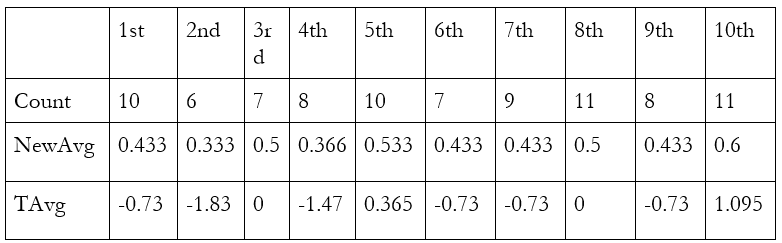
Incredible! Just as the theorem predicts, seven of our ten random samples have a transformed average between -1 and 1. That’s as close to 68.2% as we can get, which is the percentage of outcomes that are within one standard deviation of the mean in the normal distribution. If you want to do this experiment yourself, follow along very, very carefully. I calculated the transformed average incorrectly four times before getting it right.
So now we have our central limit theorem, which is very neat, since it tells us how often a random sample will produce an extreme result when the real average is zero or some other number. But we’ve been relying on knowing what the standard deviation really is in the population. Normally, we have to rely on an estimate, called the standard error.
Unfortunately, something a bit funny has happened with the language used to talk about statistics. What we care about in this case is the standard error of the mean, which has this formula:
And what I was calling the “standard error” earlier is really an estimator of the standard error of the mean, which is colloquially called the standard error. Here’s the formula for it.
In the formula, σx is the standard deviation within your random sample. So to estimate the standard error of the mean, we just use the standard deviation within the random sample.
Now we need to show two things. First, that the formula for the standard error of the mean really does make sense. Second, that you can estimate it by using the sample standard deviation.
The random variable x that we’re interested in has a mean we can estimate by taking the average of a random sample of size n: x1, x2, …, xn. The formula is
Remember, this summation notation can be read as “Sum each indexed number xi from the first indexed number x1 to the final indexed number xn”. To get to the standard error of the mean, we need to begin with the variance of the mean.
To advance further, we need a special trick. You can either read about it, or just read the title and trust that it works.
Trick: The variance of the sum of independent random variables is the sum of the variances of those random variables
To show that we can use this trick, begin by looking at the formula for the variance of x.
What’s going on here? When we write E[ ], we mean the “expectation” of something, which is a funny way of saying the average. So all this is saying is “the variance of x is the average squared difference between x and the average of x”. That’s the same thing as before—we just wrote it in a different way.
Now consider two different random variables x and y. x could be a dice roll while y is a coin flip. Replace x with x + y.
This isn’t looking very nice. To advance, you need to know that the average of the sum of two random variables, E(x+y), is the same thing as the sum of their averages. This should feel intuitive to you. When we take the average of something, we’re just making a sum and dividing by the number of observations. That could be
(1+1+4)/3 = 2
The average of something else could be
(-1 + 3 + 1)/3 = 1.
If we combine the two and take their average, we get
(1+1+4-1+3+1)/3 = 3
If we sum their averages, we get 2+1 = 3. It’s the same thing. When we take the average of the sum of the two, we’re combining the left-hand sides of the first two equations I gave you. When we take the sum of the averages, we’re combining the right-hand side.
So, now we can return to the variance of x + y and split E(x+y) into E(x) + E(y). Notice that because we were subtracting E(x+y), we are now subtracting E(x) and E(y).
Change the order.
Now we multiply out the square here. It may be a bit hard to see, but the contents of the first expectation are being multiplied by themselves.
Now apply the fact that the expectation of a sum is the sum of the expectations. (That’s another way to say that the average of a sum is the sum of the averages.)
There’s a lot going on here, but look closely. The very first term in the sum is the formula for the variance of x again. It’s the average squared difference between x and the average of x. The variance of y also appears here. So, we can simplify both to Var(x) and Var(y).
Now there’s just one troublemaker on the right. Luckily, we’ve seen this before, too: it’s the covariance of x and y, with a two inside it. We can just take it out.
This tells us that, as long as the covariance of x and y is zero—in other words, as long as we’re looking at two random variables that have nothing to do with each other, like a coin toss and a dice roll—the variance of the sum is the sum of the variances. Trick established!
Here’s the formula we’re working with again. Remember, we’re trying to find the variance of the mean.
We just established that the variance of a sum is the sum of the variances, so long as the random variables are independent. Each xi in the formula is a random variable (because we’re working with a random sample!), so they’re all independent. That means we can apply the rule.
Ah, but something else funny is going on. Why did 1/n turn into 1/(n^2)? The answer is that when a random variable is multiplied by a constant, like (1/n), the variance of that random variable is multiplied by the square of that constant, in this case 1/(n^2). (Think: if you’re multiplying 1/n by itself, multiply the numerator by itself and the denominator by itself. 1*1 = 1, so it’s 1/(n^2).) Let’s establish this trick.
Trick: Var(cx) = c2Var(x)
This one isn’t too bad. Consider the formula for the variance of x.
Multiply every observation of x by a constant c. (This multiplies the mean by c as well.)
Multiply out the square.
Take the constant out of the sum.
Aha! Look. We have c2 multiplied by something that should be the variance of x. (We expect it to be the variance of x because what we wanted to show from the start is that the variance of cx is c^2 times the variance of x.) And indeed it is: if you take the formula for the variance of x and multiply out the square term, you get what we’ve shown above. (Remember, here “multiply out” just means apply the definition of squaring something. In general, it means simplify something involving multiplication as much as possible.)
Return to the formula we just had:
We have a simpler symbol for the variance of x, so let’s just use that.
We’re summing a constant. So, we can just write n times the constant instead of the summation notation.
Now we just cancel an n and voila:
So the variance of the average of x is just the variance of x divided by our sample size. Notice how if our sample size n is 1, the variance is just the regular old variance of x, which is exactly what you would expect. Finally, the standard deviation of the mean is just the square root of the variance, given above:
Now you just replace the standard deviation in the numerator with the standard deviation in the sample, and we have our estimator: the standard error.
Is that a “good” estimator? Well, certainly it should be one if we can expect the sample standard deviation to be about the same as the standard deviation in the population. We’re working with a random sample, so of course we can.7
We’ve learned a lot so far, but how does this all connect back to regression techniques? We’ve only learned that the normal distribution describes how averages of random samples behave, which allows us to learn exactly how often our sample averages will be as extreme as what we’ve observed if the real average is, say, zero. What we really want to know is that estimates of regression coefficients like β1 behave in the same way. That way, we can ask questions like “How often could we expect this relationship to appear just by random chance?”
So we want to know two things. First, that the central limit theorem applies to b1, our estimate of β1. That means that as our sample size gets bigger and bigger, estimates of β1 cluster around the real β1 and follow the normal distribution. For example, 68.2% of our estimates will be within one standard deviation of β1. Second, that there is some working formula to estimate the standard deviation of b1.
Proving that the central limit theorem applies to b1 is very hard. You can look around on the internet for something like that if you want to. If you want something easier, we can do a computer simulation to convince you it works. Sai Krishna Dammalapati, a blogger on Medium, generated a simple, fake dataset. The x values are the numbers 1 through 20. The y values are generated so that we have a certain right answer: the true regression coefficient is β1 = 0.3. Random errors are assigned to each data point.
If our estimator b1 works as we’d like it to, one feature that will arise from the central limit theorem is working confidence intervals. That means the 95% confidence intervals generated by using the standard error of the regression coefficient will capture the true regression coefficient 95% of the time. Indeed they do:

Above, you can see blue lines for every confidence interval that captured the real regression coefficient. There are red lines for the confidence intervals that didn’t. To be clear about what’s going on here, we’ve fabricated a fake population we know all about such that a certain relationship applies, then we’ve taken random samples over and over again. From each random sample, we estimate the relationship, and then put a confidence interval around it using our estimated standard error. If the CLT applies to regression coefficients, these confidence intervals should capture the real coefficient, 0.3, 95% of the time, and that’s what we see in these simulations.
Part 3: Does immigration decrease wages?
We’d like to know if letting in more immigrants causes the wages of people already living in a country to go down. To find evidence, we could do a simple linear regression describing the correlation between immigration and wages. We could try to solve our worries about omitted variable bias with a multiple linear regression, but perhaps that isn’t convincing enough to you.
Let’s introduce another problem we’d like to solve. Maybe, regardless of the effect of immigration on wages, wages themselves affect immigration (in fact, they surely do, since immigrants tend to seek better lives). That would skew our picture: immigration may seem to cause higher wages when it’s the other way around. This problem of two-way causation is so bad that it’s not clear how even multiple linear regression could solve it.8
We need another way: instrumental variables (IV) estimation. Instead of using all of the variation in immigration we can find in our data, we only use the variation that is explained or predicted by something that is “as good as random”, our instrument. It must meet three requirements:
Relevance: it must be correlated with our independent variable, in this case, immigration.
Exogeneity: it must be “as good as random”, meaning it does not suffer from omitted variable bias itself. Nothing else that could affect the outcome, wages, is correlated with it. Check the second paragraph of footnote 7, linked above, for extra commentary.
Exclusion restriction: it must not have any direct effect on the outcome, wages. The only way it can affect the outcome is through our independent variable, immigration.
Our statistical journey now takes us to Denmark, through the work of Mette Foged and Giovanni Peri, “Immigrants’ Effect on Native Workers: New Analysis on Longitudinal Data”. Rather than explaining the study myself, I will take this as an opportunity to guide you through the abstract, meaning the summary provided by the authors.
“Using longitudinal data on the universe of workers in Denmark during the period 1991-2008, we track the labor market outcomes of low-skilled natives in response to an exogenous inflow of low-skilled immigrants.” That’s the first sentence, and what a sentence! Longitudinal data tracks multiple entities, in this case workers, across multiple points in time. It’s also known as panel data. In this case, we say we have panel data because we have data describing the incomes of many workers at many points in time. The other two types of data, which you can imagine for yourself, are data on many entities at one point in time, called cross-sectional data, and data on one entity tracked over time, called time series data. A single poll of voters is a form of cross-sectional data, while the GDP of Tibet over time is time series data.
Their longitudinal data is about low-skilled natives. Low-skilled is a somewhat offensive term to many; you should simply think of this as one way economists describe workers with little education or training outside of the workplace. They don’t mean any harm by it, and would probably own up to the slight mean-spiritedness of it. “Natives” is shorthand for anyone residing in Denmark before the immigrants came. It doesn’t refer to anyone who might be like a Danish equivalent to a Native American or the Maori of New Zealand.
Then we see the term exogenous again. This means the immigrants entering the workforce did so in a way that was apparently uncorrelated with other things that could affect wages and employment for natives.
Putting it all together, the first sentence tells you they used a sample of low-skilled workers in Denmark tracked across time, from 1991 to 2008, and tracked their labor market outcomes in relation to immigrant workers who entered at the time. Now let’s move on to the rest. This is where their instrumental variable enters the picture.
“We innovate on previous identification strategies by considering immigrants distributed across municipalities by a refugee dispersal policy in place between 1986 and 1998. We find that an increase in the supply of refugee-country immigrants pushed less educated native workers (especially the young and low-tenured ones) to pursue less manual-intensive occupations. As a result immigration had positive effects on native unskilled wages, employment, and occupational mobility.”
What a result! Rather than decreasing wages, the refugee immigrants actually raised wages for native Danes. But what are they saying about how they figured this out? An identification strategy is just any method used to identify causal effects using data. Here, their identification strategy is their instrument, a refugee dispersal policy. As it turns out, the way refugees were dispersed across the country was as good as random, and naturally it met the other two requirements for an instrument. (You should go back to the list and think about why this is obvious.) By looking at parts of Denmark that had more refugees because of this policy (rather than more refugees in general) and comparing them to places that had fewer because of this policy, they find that the refugees raised wages for native Danes.
But how can this be? This is the first time in this essay econometrics has led us to a conclusion that defies common sense. Conservatives and liberals, Republicans and Democrats, all generally believe that more immigration means lower wages. The liberal angle is typically one of empathy and consumerism, focusing on how immigrants contribute to the country and could hopefully bring down prices.
Supply and demand, once again, proves to be a good model. Without introducing any explicit graphs, the common issue is simple: people assume immigrants only work, and never spend. Importantly, at any given wage rate, more workers are willing to do the job. For the new workers to get jobs, wages must fall, and they’re happy to make them fall by offering to work for a lower wage.

But not only do immigrants increase labor supply, they increase labor demand. When immigrants show up and spend their own money on goods, firms are encouraged to produce more goods to sell. To do that, they need to hire more workers as well.

With more labor supply and more labor demand, there’s no downward pressure on wages. They can stay the same. So it isn’t too surprising that, by pushing natives into more skilled labor, immigrants managed to increase wages.
This is an unusual result in the field of economics, which I only included to show that common sense is not a very good predictor when it comes to economics. Most estimates of the effect of immigration on native wages and employment are near zero, meaning it appears to do nothing, which is what we expect from the graph above. But you’ll have to wait for the next post for a substantial treatment of how research can be summarized, allowing everyone to arrive at similar conclusions, even if not identical ones.
Mathematical Interlude 3
If you have your own data, how do you apply this method? The short answer is that you can use the computer methods described later. But maybe you aren’t good with computers and just want a formula.
If you are trying to estimate the effect of some variable x, like immigration levels, on an outcome y, like wages for natives, and you have an instrumental variable z, like Danish immigration policy, you can estimate the βs in the model
yi = β0 + β1*xi + ei
using the formula
Notice that this takes the covariance of z with y and divides it by the covariance of z with x. The formula for b0 is just as before, but uses our new estimate of b1:
b0 = ȳ - b1x̄
Unequal Changes in Supply and Demand
We saw that when labor supply increases, we also see an increase in labor demand. But economists generally agree (and very rarely disagree, with some saying they’re uncertain) that low-skilled workers immigrating here would make some low-skilled workers already in the US substantially worse off. Clearly, there’s some nuance to add.
In general, immigration does not appear to decrease wages in the United States. This was true in the 1980s when thousands of Cubans suddenly migrated to Miami, Florida in the Mariel boatlift and had no significant effect on wages there, as studied by David Card. But these results only occur because immigrants are generally dispersed between many industries. Why?
Assume for a moment that we have a group of immigrants who are all trained, self-employed electricians. They’re definitely going to increase the supply of electricians, like how labor supply increased before. But will demand for electricians increase just as much? Definitely not. That’s because electricians don’t just spend their income on paying for other electricians to fix their house—in fact, I wouldn’t expect them to do that at all, so only labor supply will increase. The new electricians will compete with the old ones, and if they want people to buy their services, they’re going to have to cut prices. The bad immigration economics from before is now correct.

In reality, immigration doesn’t usually occur this way. But it has happened before: when lots of Soviet mathematicians came to the United States, American mathematicians who worked in the same fields as their new Soviet friends became less productive and earned less income, just as we would expect, although the authors of the study examining this change noted different things when explaining it. It seems that the optimal immigration policy is to make sure that new immigrants look like current American residents, with comparable numbers of electricians and mathematics professors.
Strangely, our current immigration policy is the opposite of this: seek only high-skilled immigrants, and restrict the rest. Executed properly, we would see falling inequality as labor supply increases for our most skilled workers and stays about the same for the least skilled. In practice, it appears that total immigration to the United States, including undocumented immigration, is not very biased toward skilled or unskilled workers. A more complete treatment of the issue of mass deportation (albeit a snarky one) was linked a moment ago.
Next, we’ll look at another result you might find counterintuitive, and the especially convincing method used to find it.
Part 4: Does the minimum wage cause unemployment?
When testing a new treatment for a disease, ideally researchers can do what’s called a randomized controlled trial. This randomly assigns people to a treatment group or a control group. In the treatment group, you might receive a new medication for Alzheimer’s. We could conclude it works if the people in the treatment group live longer and have better mental clarity after receiving the medication, when compared to the control group. Both can be expected to experience higher rates of Alzheimer’s over time, so what you really need to compare between the two groups is how much their rates of Alzheimer’s increased. Ideally, one would rise while the other stays the same.
The nice thing about this method is that it prevents omitted variable bias through random assignment. If participants in the control group tended to be more overweight than those in the treatment group, they could die more often even if the treatment works. Randomly assigning people prevents this from happening.
The next method is the same thing, but without random assignment. Econometricians call it differences in differences. To do this, you first find two groups that seem to be similar, even if you did not randomly assign them, such as the residents of two similar cities. We then see if a policy change in one of the cities causes it to diverge from the other in some way, in the same way we see if a new Alzheimer’s medication causes the treatment group to diverge from the other in terms of memory and other symptoms, especially death.
This method was a part of the credibility revolution in economics, which occurred during the 1990s. One of its signature and most famous studies was David Card and Alan Krueger’s study of the minimum wage increase in New Jersey. Card’s treatment group was a random sample of fast-food stores near New Jersey’s border with Pennsylvania. The control group, naturally, was those on the other side of the border. Here is the data:

Strangely, employment fell in Pennsylvania and grew in New Jersey. New Jersey forcefully made employment more expensive and somehow got more of it. New Jersey employment rose faster than Pennsylvanian employment, that is, the difference in differences is positive:
-0.14 - (-2.89) = 2.75
This positive number tells us that effect of the minimum wage on employment was positive.
This study created quite a wave in the field of economics, making economists question whether the minimum wage really has any effect on employment at all. Further studies led to the current consensus that the minimum wage does hurt employment, but the effect is small, making it an arguably good policy for workers. Specifically, the average estimate of the percentage change in hours of work lost per dollar increase in the minimum wage is -14.8%, at least according to Neumark & Shirley’s 2021 literature review.
When using differences in differences, what we’re really doing is controlling for some poorly-named “entity fixed effects”. These are effects that vary across entities, but not over time. (As an example, an entity fixed effect everyone has is their height. Your height might affect your life outcomes, and it doesn’t vary much over time once you’re an adult.)
In this case, the entity fixed effect we care about most is whatever causes the different initial levels of employment in Pennsylvania and New Jersey. To solve our problem, we look at how the two states change over time, instead of just observing employment levels after the minimum wage hike. Without the minimum wage hike we would expect the two states to change over time in the same way, even if they’re different at any particular moment. But if there’s a difference in the differences—a difference in how they change over time—the minimum wage really mattered.
Confused about the name “entity fixed effects”? Of course. The counterpart is time fixed effects, which vary over time but not across entities, even though the name tells you they’re fixed. It’s best to simply remember that the definitions are the opposite of what you would expect. I admit that other scientists are better at naming things than econometricians. They do perhaps still have an advantage over evolutionary biologists, who decided naming things in Latin was a good idea when doing so conveys no additional information.9
Our next part is dedicated to fixed effects regressions. These make the math a little more complicated, but perhaps more convincing as a consequence.
Part 5: Do alcohol taxes reduce deaths from drunk driving?
US states with higher alcohol taxes tend to have more deaths from drunk driving. If that makes no sense to you, good! We’d expect people to drink less alcohol if it gets more expensive, and to drive drunk less often as a consequence. Unlike the previous part, this picture has no truth to it other than an error in how the effect of alcohol taxes is measured.
The evidence used in this part comes from Introduction to Econometrics with R from Hanck et al., but was inspired by the work included by Professor Yesuf in his applied econometrics class at American University. Here is Hanck et al.’s graph of beer taxes against traffic fatalities in 1988.

There’s no perverse way the government is making things worse here. It’s only omitted variable bias. This time, we need to control for entity fixed effects (specifically state fixed effects) to avoid the trouble. At this point, that sentence should still confuse you. I mean that if we want to see how alcohol taxes affect deaths from drunk driving, we should look at how states change over time as they impose alcohol taxes and compare them to how states change when they don’t. The technique here is fundamentally the same as differences in differences.
To do that and use even more data than in the previous part, we’ll need a fixed effects regression. In a multiple linear regression, we talked about adding controls to our model, estimating the effects of GPA and major at the same time. But what are we estimating the effect of here? The answer is that we’re estimating the effect of a state itself.
This could look a little funny when writing a model. We could take this model
drunkdrivedeathsi = β0 + β1*alcoholtaxi + ei
and then add dummy variables for every state. That means we add a variable “alabama” that equals 1 only if an entry in our dataset comes from Alabama, and do the same for the other states.
drunkdrivedeathsi = β0 + β1*alcoholtaxi + β2*alabamai + β3*alaskai + … + ei
The entire model would be very large if I included every variable. But there are two issues with this model that shouldn’t be obvious to you at this point. First, I said we would add a variable for the other states, seemingly implying there’ll be one for every state. But there’s a problem. If you control for just 49 states, you are implicitly controlling for the last one, because when all of those 49 dummy variables equal 0, it must be because the 50th state in your list is the one you’re looking at. That means if you add a dummy variable for that state, you are controlling for it twice! The math doesn’t work, and any computer you try doing this with will stubbornly refuse. If you’re using a statistical program like Stata, it will decide to drop one of your dummy variables.
The other issue is this. We have a little subscript i to indicate an entity, but what about time? We were talking about looking at how different states vary over time, rather than just comparing different states at one point in time. That’s why we need two subscripts now: an “i” for the entity, and a “t” for the point in time.
drunkdrivedeathsit = β0 + β1*alcoholtaxit + β2*alaskai + β3*alabamai + … + eit
Notice that there is no t attached to the different states. That’s because we assumed the effect of these states does not vary over time.
If this model were written to describe only the second period in a dataset, the t would be replaced with a 2. If we measuring by month and the data begins in April, for example, the model below would describe May.
drunkdrivedeathsi2 = β0 + β1*alcoholtaxi2 + β2*alaskai2 + β3*alabamai2 + … + ei2
We could further condense this model by replacing the different states with a single variable “X” that sometimes appears in economics papers, called a “vector of covariates”. That just means a bunch of different variables that might affect the outcome, written as a single variable for brevity.
Contrast a covariate, which is anything that affects the outcome, with a potential source of omitted variable bias: a covariate only needs to affect the outcome, like how a pandemic would affect the number of drunk driving deaths, while a confounder should also be correlated with something we want to estimate the effect of, like alcohol taxes.
Nothing here is fundamentally different from multiple linear regression. The math is the same. We just want the model to consider how the state itself could affect the outcome. That might happen because a state is especially rural, with low population density, making interactions between cars less frequent.
Here’s a simple example that shows how this works. Say we want to know what effect immigration has on the average income. We know immigration levels differ between countries, but countries also differ for other reasons. Here’s the average incomes of Canada and the United States from 1994 to 2023.

If we add variables for Canada and the United States, controlling for them, you can imagine that as moving the lines and putting them next to each other. That would allow us to focus on where the difference between the two changes with changes in immigration levels—the difference in differences, like before. As a matter of fact, FRED lets use remake these series as indices that both equal 100 at a particular date, showing what this looks like:

Fascinating! We can easily see that Canada and the United States got richer and poorer in tandem until 2014, when Canadian growth suddenly ground to a halt. I’m not an expert on the Canadian economy and a cursory search was not much help, so I can’t explain why this happened.
With time fixed effects, we’re saying that we’d like to estimate the effect of a particular period in time. A recession might have occurred during a certain year, for example, and we don’t want that to influence our estimate of the effect of an alcohol tax, β1, since it might have been implemented at the same time the recession happened.
Now that we’ve discussed how this model works, we can find out whether alcohol taxes really do reduce deaths from drunk driving. Here’s a visual representation of our method: compare the change in the beer tax to the change in the vehicle fatality rate.

Places where the beer tax rose more also saw their fatality rate from car accidents fall more. As for the regression results, they show the same pattern. The coefficient on beer taxes, meaning the reduction in traffic fatalities per 10k people for every extra dollar of taxes that must be paid for a case of beer, was -0.6559.10
Because that number might seem small, now is a good time to talk about the difference between statistical significance and practical significance. The coefficient above was statistically significant at the 1% level. That means if beer taxes didn’t matter, a result like this would occur by random chance less than 1% of the time.
But we should also consider whether it’s practically significant. The coefficient tells us that in a state like Oregon, where 4,223,000 people live, a $1 tax on beer cases would save 277 lives each year. (To get this number, divide the population by 10k, then multiply by the coefficient.) That sounds like a good tradeoff to me, but it might be less flattering to some if we measured the number of lost jobs in the brewing industry for every $1 of tax imposed on a case of beer. Would you want such a tax if it meant 100,000 people lost their jobs for every life saved? It could prove to be a relatively inefficient way to save lives compared to other methods. Even charity might be better. Thankfully, I am 99% confident the actual number of lost jobs would be smaller than that if you measured it.
Part 6: Does it pay to be an economics major?
When we learned about multiple linear regression, we found that both GPA and major affect your income after college. But I excluded a funny result in that paper. Ranked by average income, economics majors came in 4th in Paul Oehrlein’s paper. But once you controlled for GPA, standardized test scores, race, sex, and other things that might affect income, economics majors dropped to 14th place, while the top three stayed in the top three. So in this paper, it looks like economics is less useful to study than home economics, which came in 13th place once you controlled for those other variables! That’s an entirely different field centered around professionalizing housework. It would be really embarrassing if prideful economists were no better than housemaids at making money.
Fortunately, there is good reason to doubt the results here. The number of economics majors included in the sample was small, at just 32, and the effect of the economics major on income was not statistically significant. That means there’s a good chance it could have really been zero, which is worse, but it also means there was a lot of variation and little information, so we probably can’t reject the possibility that the effect is larger, either. We would need to do a formal statistical test with the original dataset to know.
Our next technique is called regression discontinuity design. It’s a common-sense method. If you look at a graph of the GDP of the United States (i.e. total income in the country) before and after President Herbert Hoover took office, you don’t need to mark January 20th, 1929 to notice what happened.

Note that “Real GDP” means we’ve adjusted the data for price changes. Here prices have been inflated to be comparable to those in the year 2000.
As you can see, there’s a “discontinuity” in this graph: when Hoover took office, the economy got a lot worse. The income people gained in the previous decade started to vanish. Regression discontinuity design is a way to formalize this common-sense notion that if two things coincide, they’re related. It tells you the probability of the discontinuity occurring if it just happened by random chance, given the trend we saw before it happened.
This example also reveals a flaw in our common sense, and this technique. No economist believes that Herbert Hoover caused the Great Depression, though he may have contributed to it in certain ways. The dominant explanation is the monetary policy of the Federal Reserve, which is well described by the work of economist and former Federal Reserve chairman Ben Bernanke. At the time, they kept interest rates high when they needed to be cut to juice the economy. None of Hoover’s policies appear as important as those of the Federal Reserve, in light of what economists have seen in other situations.
Our application of regression discontinuity design looks at a policy that prevented students with a GPA below a certain threshold from declaring their major. At the University of California, Santa Cruz, students with a GPA below 2.8 in Economics 1 and 2 were not allowed to declare economics as their major. You could raise your GPA later and qualify anyway, but those who just barely met the threshold were 36 percentage points more likely to declare economics as their major. That means, when compared to those with slightly lower GPAs, some of them were practically assigned the economics major by random chance!
According to the authors of a paper analyzing this phenomenon, Zachary Bleemer and Aashish Mehta, “Students who barely met the grade point average threshold to major in economics earned $22,000 (46 percent) higher annual early-career wages than they would have with their second-choice majors.” Here is their graph describing this change. The GPA threshold is marked with a dashed line.

As we saw before, students with higher GPAs earned more money, both below and above the threshold. But right as the threshold is met, there’s a sudden jump in the average annual wage earned by students after graduating.
Also included in the graph are effect estimates using two different techniques you saw in previous parts: a linear regression, showing an $8,000 per year benefit to the major, and an instrumental variable regression, showing a $22,000 per year benefit. (Check the bottom right, above the indicator for a GPA of 3.5.) In this case, the instrument is the threshold, and the variable we’re “instrumenting for” (replacing with the instrument) is the economics major. Try to remember all three requirements for an instrumental variable, or go back to part 3 and look at them. Does this GPA threshold policy meet the requirements? How confident can you be about each of them?
Part 7: Who will win the 2026 US House of Representatives Elections?
So far, we’ve looked at models where the outcome can be measured as a quantity like dollars. We also saw that we can predict things like this using “dummy variables” that can only take on two values: 0 or 1. But what if the outcome is a dummy variable?
One option for such a dummy variable is control of the US House of Representatives. We might decide (arbitrarily) that a 1 indicates control for Democrats and a 0 indicates control for Republicans, and try to predict that with a variable that describes how far ahead, or behind, Democrats are relative to Republicans in “generic ballot” polls, which ask potential voters which party they prefer. Here, the entities we’re indexing are election cycles.
dem_wini = β0 + β1*dem_generic_poll_leadi + ei
This is called a linear probability model. It’s called “linear” because we assume the effect of a higher polling lead on a party’s win probability is constant.
The problem here is that you’ll likely wind up with predictions that don’t make sense. If β0 is 0.5 while β1 is 0.1, for example, then the prediction for dem_win will be 1.1 if Democrats are 6 points ahead, or a 110% probability of victory. In that case, clearly the model thinks Democrats will likely win, but the number is meaningless.
Alternatively, we have probit and logit models. They are essentially the same, so I will focus on probit models, which are more commonly used. Logit models were more common when computers were weaker and a simpler formula was useful. In both cases, the essential idea is the same: as our independent variables get especially large or small, we want the predicted probability to get very close to 1 or 0, but never go above 1 or below 0. So we’ll get an S-shaped curve. How can we get one? Here’s what we’ll use:

These are different versions of the cumulative distribution function, or CDF, of the normal distribution, courtesy of Inductiveload on Wikipedia. It’s useful to bring back a visual of the normal distribution to understand where these lines come from.

Imagine walking from left to right across this bell curve. As you walk, you scoop up the distribution beneath you. In your first step, you scoop up just a little bit of it. You scoop up much more on your second step, then much more again, and again. Once you’ve reached the middle, you’ve scooped up half the distribution. As you walk further, you scoop up less and less until you grab the last 0.1% of it. This is what the cumulative distribution function does: it tells you how much of the distribution you’ve accumulated after each step. That gives it an S shape, increasing a little at first, then very fast, and then it starts to slow down at the halfway point.
The normal CDF is usually denoted with the Greek character phi. And when we want to estimate the coefficients for a model that uses this distribution, the model looks like this:
This takes a number from something like a linear probability model as an input and spits out a probability from the normal CDF. This gives us the nice feature we wanted: probabilities no longer exceed 1 or fall below 0. The unfortunate aspect of this model is that you need a computer to use it since there is no formula for the normal CDF, unlike a logit model:
where e is no longer an error term but Euler’s number, which is about 2.72.11
Allow me to give you a better idea of what we’re doing here, in concept.12 Let’s say we’re just asking “What’s the probability that Republicans win if they’re 3 points ahead on the generic ballot?” If the future is at all like the past, then we can look at cases where either party was that far ahead in the past and check to see how often they won. Then we can say “Well, in the past parties with this lead won about 65% of the time, so they have a 65% chance of winning.” We can do the same thing with any other number, whether a 6 point lead or a 10 point deficit. Probit and logit models give us ways to use all of the data we have at once to figure out a probability of victory for any polling lead or deficit. That’s much better than saying “Well, there were two occasions where a party had a 10-point lead and they won in both cases, so they have a 100% chance of victory today.” You could definitely lose a lead like that, even if we haven’t observed that yet, and other cases of positive leads make that clear. (It’s also an implicit assumption of the model that nothing is ever completely certain.)
Now that we have a way to work with outcomes that either happen or don’t, let’s try to predict the 2026 US House of Representatives Elections. This was written in mid-2025, so rather than relying on polling data (which can be a poor predictor this far from election day), I’ll look at the predictive power of something else: whether the last presidential election was won by the Democratic candidate or the Republican candidate. For simplicity, I’ll use only the last twenty presidential elections and the midterm elections that followed them.

There’s a very strong pattern here, and we don’t need a regression to see it. When Democrats have won the last presidential race, they have lost the following midterm elections every time in the past ten presidential cycles. This occurred five times. The same thing is almost true of Republicans: when they’ve won the last presidential race, they’ve lost the following midterm elections four out of five times, or 80% of the time. Averaging these two patterns out, this pattern suggests we should be 90% confident Republicans will lose the House next year.
But hold your horses, because that’s a very high level of confidence, and with only ten observations, perhaps we should be more skeptical. In any case, we should also fit a probit regression to this small dataset and check the results. Doing this leads to a funny result: if Democrats won the last presidential election, it is over 99% confident they will lose the midterms, but if they lost the last presidential election, it is only 75% confident they’ll win the midterms. Perhaps not by coincidence, the betting market Kalshi currently gives Democrats a 79% chance of winning next year, which is very close to what history suggests. When I originally wrote this in early 2025, they actually gave them exactly a 75% chance, but Trump’s tariff announcement made them much more confident, with Democrats reaching a high of 84.3% on April 10th.
The methods used by actual statisticians to forecast elections are more advanced than what I have presented here, but are fundamentally the same. They rely on polling data and other variables to forecast elections with random simulations. As you’ll see in the next part, which elaborates on exactly how these percentages work, they tend to be very good at their jobs.
Many disagree strongly with the forecasting methods used by statisticians. Professor Limarzi of American University, who taught me number theory, is one such person. According to him, a probability doesn’t make sense for a presidential race because it only happens once. To some degree I’ve come to agree with him, but for a reason perhaps different from his own. Elections are all unique. They don’t obey the same rules in the way a dice roll obeys the laws of physics every time. Between elections, the rules that decide how easy it is for someone to vote can change. The issues that could motivate voters or not, and the demographics of the voters themselves, also change. While you can observe the probability of rolling a six and forecast future dice rolls, you can’t quite do the same thing with elections. This was to the great misfortune of Professor Allan Lichtman, also of American University, who predicted with complete confidence that Kamala Harris would beat Donald Trump using only variables akin to the one we just used, and no polls. The right move, I think, is to try to make predictions using the past but to make your predictions less confident than simple mathematical models tell you to make them.
Part 8: Other issues, and a summary
Nonlinearities in regressions
To complete the discussion of econometrics, I’ll give mention to the problem of nonlinear patterns. When this happens, the effect of x on some outcome y is not constant, and a linear regression of any kind will not provide a good fit. We’ll probably still capture the right effect direction—even if the pattern isn’t linear, a linear regression should correctly tell you if something positively affects something else, rather than negatively. But it’s always better to capture this if you can.

A log-linear model is simply a model where you have taken the outcome variable and applied the natural log function, usually denoted ln(), to every observation of it. This function tells you the power Euler’s number e must be raised to for you to get the inputted number. For example, if income is the outcome and one of your observations is $40,000, the natural log of it is ln(40000) ≈ 10.6, and sure enough e^10.6 is about 40,000.
If x appears to have an increasing return to income, as in the picture on the left, applying this transformation allows you to capture that while using a simple linear regression. You may be curious about why this works, so here’s one explanation. In the picture on the left, you could say that y is increasing “too quickly.” If we want to apply a linear regression, it should slow down. The natural log function makes this happen. The natural log of 2 is about 0.7 while the natural log of 3 is about 1.1. But when you look at much greater numbers, a one-unit increase does not increase the output of the natural log function very much: ln(100) ≈ 4.61 while ln(101) ≈ 4.62.
When a log-linear model is applied, our interpretation of the effect of x on the outcome, β1, changes. If β1 = 1, we’d usually say that a one-unit increase in x is associated with a one-unit increase in y. Once we’ve applied a log-linear model, we instead say that a one-unit increase in x is associated with a β1*100% change in y. For example, if β1 = 0.05, then a one-unit increase in x is associated with a 5% increase in y. That’s even more interesting than the fact that the method works. To understand why we can say that, you’ll have to read the next mathematical interlude.
Alternatively, x might appear to have diminishing returns, as in the picture on the right. We could instead say x is income and y is happiness. In this case, applying a linear-log model would work. That means we transform every observation of x with the natural log function. Once you’ve done that, a one percent change in x is associated with a β1/100 unit change in y. For example, if β1 = 2.011, then a 1% increase in x is associated with a 0.02011 unit increase in y.
If instead, we think that a 1% increase in x is associated with some x% change in y, we need a log-log model, which gives us that interpretation. Given the previous two explanations, it should be clear how this works.
Finally, in either the log-linear or linear-log case, we could instead use a square term for x. This is a much simpler methods. When we add a square term, we transform the x values by multiplying them by themselves (squaring them) and then add those transformed values as an independent variable. You might want to avoid this because it’s not as easy to interpret; when interpreting such a model you need to look at two separate coefficients.
Mathematical Interlude 4: Why Can We Interpret It Like That?
I lied, you actually can’t. I thought it would be funny to include something here that is completely made-up and see if you caught it.
Ok, you actually can interpret log-linear, linear-log, and log-log models like that. But I, and the typical econometrics teacher, mislead a little when explaining it. You can only apply the percentage interpretation for small changes in the independent variable x, because it’s an approximation, not a literal rule of how these models work. Explaining why we can use these interpretations requires repeated use of calculus, and I’ve already asked you to learn quite a bit or take some leaps of faith. I’m just going to table this one. If it helps, I checked, and ChatGPT is pretty good at answering questions about this stuff.
This part of the essay is already pretty excessive, since this was written to show you how economics can be scientific, not exactly how you can do econometrics and why it works. The other parts had a justification in being used to show this isn’t complete bullshit and these mathematical ideas come from reasonable origins.
Interaction terms
Consider the case where you want to know what effect years of schooling have on income. You guess that years of schooling have lower returns if you’re black, and you want to investigate this relationship. This can be done with something called an interaction term.
In this case, we want to know the effect of an extra year of schooling and being black. So we need a variable that describes this: it should only be greater than zero if someone is black and has some amount of schooling. You can create such a variable by creating a dummy variable for whether someone is black (1) or not (0), and then multiplying every observation of this dummy variable by each person’s years of schooling. Here’s what the model looks like now.
incomei = β0 + β1*schoolyearsi + β2*(schoolyearsi*blacki) + ei
If you estimated this model as a multiple linear regression, β2 will probably be negative. It will tell you the penalty that someone gets for going through another year of schooling while being black. Note that this doesn’t mean an extra year of schooling lowers your income if you’re black. If you observed this pattern, β1 would still be greater than the penalty β2, and the difference between the two would tell you the return to schooling for black people.
Sensitive issues in statistics
I would now like to mention some things I wish more econometrics professors mentioned. Racial issues are sensitive because it’s always possible to say something you didn’t intend and hurt someone. Talking about this model could easily make it seem like you think black people are inherently stupid. But with observations like this, you would not know anything about that, only that black people do not seem to gain as much income from schooling, for whatever reason. Be careful about your phrasing.
It's also possible that while examining some data, you come to the conclusion that black people really do tend to be inferior in some sense. You may even decide to call yourself a race realist and vocalize this loudly because you worry people are hiding the truth.
This is not a good idea, both because I think you’d be wrong, and because there’s a much better way to do it anyway. If you’re going to talk about black people tending to be more violent or stupid, you should at least spend every waking hour making your motivations clear. Any reasonable observer will see what you’re doing and assume you are some kind of white supremacist. So you should break your back telling people that you think what you’re observing is a problem that should be solved as kindly as possible, rather than a point of superiority white people should celebrate. I’ve been baffled by the behavior of people like X/Twitter user i/o, and commentator Steve Sailer, who seem to think talking about black people having lower test scores than white people without talking about solutions will be accepted as an un-racist and intellectual thing to do. Your behavior should always be discernable, in some way, from a white supremacist, even if you have something controversial to say.
A more expansive treatment of racial issues in the US is unfortunately too much of a distraction from the main point. What you should notice most here is that econometrics can be applied to racial issues, potentially providing valuable insights, even if you must tread lightly.
How to Computer: A Quick How-To Guide for Stata and R13
Maybe you have your own data and you want to look at the relationship between different variables yourself. This part of describes how you can apply these methods with Stata and R. If at any point something goes wrong and I don’t have the answer already written here, you should consider availing yourself of the help of a large language model like ChatGPT, Claude, or Gemini. They are stupid at times when it comes to the real world or basic addition and subtraction, but they are surprisingly good at coding.
Stata
Open Stata, then go to the “File” menu to open your dataset. It should be a .dta file. If you have an Excel file, use the command “import excel file_name_here”.
Now here’s how you can apply different techniques, in order of their appearance here:
To perform a simple linear regression, type “reg y x”. Read things like this as “Predict y using x” and you might have an easier time remembering them.
To perform a multiple linear regression, type “reg y x” and add as many control variables as you’d like with a space between them, e.g. “reg y x control1 control2”.
To use an instrumental variable z, type “ivregress 2sls y x (x = z)”. Note that 2sls tells Stata to use a method of estimation called two-stage least squares, similar to ordinary least squares.
Difference-in-differences does not require a regression. Go to Section II, Part 4 if you want to know how this works.
To perform a regression with fixed effects, type “xtreg y x, fe” and add controls as you would with a multiple linear regression.
Applying regression discontinuity design is a bit more complicated. You could narrow your dataset to the groups just below and just above the cutoff, which would be fairly arbitrary but would work. Alternatively, look up the rdrobust package on Google.
Applying any of these techniques will cause Stata to spit out regression results in the form of a table. This will include the coefficients you want, aligned with labels for your different variables. This will also include p-values describing the probability of acquiring a result as extreme as observed in the data given that the real coefficient is zero.
Note: when using these commands, you should probably add a comma to the end followed by the letter r (e.g. “reg y x,r”). This is because the p-values calculated by Stata with these commands will usually be too small without telling Stata to use what are called heteroskedasticity robust standard errors, or robust standard errors for short. That’s what the r stands for. The standard errors Stata normally uses assume that the errors made by your model are constant as you change the different variables you’re using to predict the outcome. In reality, the errors made by your model will almost always depend on the levels of your independent variables. This is known as “heteroskedasticity” and is described by the graphs below, from Chris Auld.
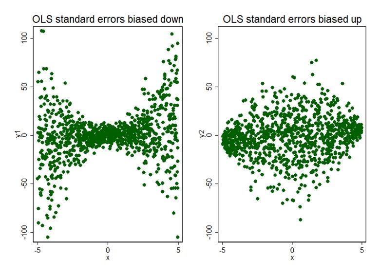
These are simplified cases, but they sort of show you why typically standard errors are biased downward: data gets more varied as we get further away from the mean of x, the thing we’re using to predict y or investigate what causes y.
R with RStudio
Stata is not free, so you may not have access to it. Instead, you might want to install R with RStudio for ease of use. You can find instructions for doing this by Googling “how to install R reddit”. R is like Stata, except everything is more confusing and weird. It’s like how Windows and Linux can both do the things you probably want to do, except all of your programmer friends insist that Linux is superior, and when you try to use it your brain quickly breaks. Anyway:
To begin running a regression with RStudio, you need to make what’s called a “data frame”, which for our purposes you can just think of as the RStudio version of a spreadsheet. I’ll assume you have this in an Excel spreadsheet like I did. Before proceeding, make sure that each column is a variable and each row is an observation. The top row of your spreadsheet should be variable names.
R cannot read the spreadsheet without the addition of a package, which is just a tool it can use. To use these, first install RTools. Google it, click the link, click RTools 4.4, then the first blue link with “installer” in the name.
With RTools installed, re-open RStudio and go to “Tools” in the very top line. Then click “Install packages…” and type “readxl”. After installing that, you need to go to where you Excel file is, right click it, and click “Copy as path”.
Now, in RStudio, click on the empty line beginning with a “>” in the console window, and use these commands by typing them and hitting enter:
library(readxl)
df <- read_excel("YOUR FILE PATH GOES HERE WITH ONE SET OF QUOTES", sheet = 1)
The first command must always be used when you want to use a package like readxl. Note: You will likely receive an error, “'\U' used without hex digits in character string (<input>:1:22)”. If this occurs, delete every backslash (“\”) in your file path and replace it with a forward slash (“/”).
You are now ready to apply different regression techniques to your dataset. When doing this, you will probably want to use the command “View(dataframe_name_here)” first, so you can see the names for your different variables. After entering the command for a regression, your regression results will appear in the environment tab, in the top right by default. Click them, and a new tab will open within the same window that R scripts appear in, in the top left by default. (One way to identify this window is to go to “File”, then “New File”, then click “R Script”)
Alternatively, you can view regression results with this command:
summary(regression_name_here)
This is perhaps superior, since it gives you t-statistics and p-values next to your coefficients. Remember that t-statistics tell you how many standard deviations away from zero your coefficient is. The p-value, labeled “Pr(>|t|)”, tells you the probability of observing a coefficient as extreme as you’re observing given that the real one is zero.
To perform a simple linear regression, use this command:
regression.name <- lm(outcome_variable_name ~ independent_variable_name, data=df)
You might have an easier time remembering this if you know “lm” stands for “linear model”. Note that in this command, “df” calls on the name of your dataset, which you established with the last command. You might later open a new dataset by using the same command with a different name:
newdata <- read_excel("FILE PATH", sheet = 1)To perform a multiple linear regression, use this command:
regression.name <- lm(outcome_variable ~ dependent_variable1 + dependent_variable2 + however_many_others_you’d_like + ..., data=df)To use an instrumental variable:
Install the “estimatr” package. Read the introduction to this section if you missed how to do this. Then use the following commands, in order. If you change the name of anything, be careful! Successive commands call on results found in previous commands using established names. Also note that you need every independent variable (or “control variable”), in the first command, not just the instrumental variable.
fs <- lm(independent_variable_not_outcome~instrumental_variable + control_variable1 + other_controls + ..., data = df)
predicted_values <- predict(fs)
tsls <- lm(outcome_variable ~ predicted_values + control_variable1 + other_controls + ..., data = df)
By this point you have instrumental variable results as “tsls” in your environment window. These results do not use robust standard errors, discussed in the previous part on Stata.
Let’s use the package. Notice the use of a “|” where you might expect a comma by now. That is used to mark where you enter the instrument and all of your control variables.
library(estimatr)iv <- iv_robust(outcome_variable ~ independent_variable_NOT_INSTRUMENT + control_variable1 + other_controls + ... | instrument + controls + ... , data = df)
Difference-in-differences does not require a regression. Go to Section II, Part 4 if you want to know how this works.
To perform a regression with entity fixed effects, use this command:
your_fixed_effects_regression_name <- lm(outcome ~ independent_variable + entity_variable_name - 1, data = df)
For example, if you have a column in your dataset labeled “state” with entries like “Oklahoma” or “OK”, you would replace “entity_variable_name” with “state”. Notice the 1 that gets subtracted; this tells R to drop one of your entities to avoid the problem of “perfect multicollinearity”, discussed earlier. If you have 50 states represented as a 0 or a 1, when the first 49 states equal 0, it’s implied that the entity you’re looking at is the 50th state. Without dropping one state, you would be asking to estimate the effect of a state while controlling for that state, which doesn’t make sense—to estimate the effect of something, you can’t keep it constant.To perform a probit regression, use this command:
probit_regression_name <- glm(outcome_variable ~ independent_variable, family = binomial(link = "probit"), data = name_of_dataframe)
Notes for the application of different techniques
Only apply a simple linear regression if there is no cause for concern about omitted variable bias! This should be a very rare case. You might want to do this if you aren’t even interested in causation in the first place and only care about the observed relationship between two things.
Multiple linear regression is only useful on its own if you can observe everything that might plausibly affect the outcome and could be correlated with the variable you’re interested in, as in Part 2 of Section II.
When selecting an instrumental variable, be wary of the requirements for one. First, make sure it’s correlated with your variable of interest and uncorrelated with anything else that might affect the outcome. You should also make sure it meets the “exclusion restriction” and has no direct effect on the outcome. However, there is no way to test the exclusion restriction, which is quite problematic. Finally, note that you should expect to need a large sample to apply this technique, because the variance of the estimator for β1 is higher when using an instrumental variable.
Fixed effects are very nice, but they aren’t everything. Think back to the differences in differences application. What if there’s some reason to expect employment in Pennsylvania to change over time in a different way? Then we can’t identify the effect of the minimum wage change in New Jersey by making a comparison. Pennsylvania might have seen its employment fall just because it’s different in some way from New Jersey. You need to make sure that the entities you’re comparing are not different like this, i.e. they would be expected to evolve over time in the same way and would only deviate because of the variable you’re interested in the effect of.
Regression discontinuity design has fairly narrow applications. If you’ve identified some arbitrary threshold that causes a treatment to appear, like becoming eligible for the economics major, it should be useful. However, think back to the example of the Great Depression. Many things affect GDP, and many things could have changed in the years surrounding the inauguration of President Hoover. If the sudden change you’re looking at could have been caused by many things, do not simply apply this technique and claim you’ve identified something that caused a change! Deviations from trends happen for a variety of reasons.
Common private sector application: Forecasting
Rather than identifying cause and effect, you might simply want to forecast the change in something over time. This is not my area of expertise, but I can still provide some advice, since I’ve successfully forecasted the only two elections I’ve tried to forecast with regression techniques, the 2020 US Senate elections and the 2024 US presidential election. For an example, I’ll use the growth of your company over time.
Once you have data on how your company has grown over time, and you’ve identified some variable that seems to predict growth, try backtesting. Here are instructions.
Remove the first time period from your sample.
Run your regression to estimate a model from the remaining periods.
Attempt to predict growth in the first time period using the model you estimated using all of the other periods.
Return to step 1 and use the next time period instead.14
If your model can’t predict things out of its own sample, it’s not a good model.
I would also encourage some degree of modesty when doing this. If you can only predict growth out of sample 65% of the time, report your forecasts with a heavy grain of salt. Instead of saying “I applied the method of maximum likelihood estimation to estimate a probabilistic model of company growth in relation to…” or anything else that sounds equally jargony and confusing, just say things with plain language, like “I used statistics to estimate the probability the company will grow [some amount over some time period], given that we’ve seen [something relevant to growth].” Use jargon only if your audience will understand it. If you think other forecasters are trying to look smart and “better” by being confusing, explain that to your superiors.
One mistake you should avoid is something called “overfitting”. If you focus on the R2 measure of how well your model fits the data, you might notice that adding more variables to your model to try to predict the outcome always increases the R2. Do not do this until you get a very good fit. Models that are overfitted in this way do a poor job of predicting the future, and you will probably see this in how this strategy might fail to predict results when backtested. Even if it still works when backtested, remember to be careful.
Conclusion
This was the longest, most difficult, and most quantitative post I have ever written. But there’s a method to the madness, and a point to the pages.
Everything you have read here, taken together, shows how the regression and quasi-experimental techniques of economists provide sensible ways to understand the world. Someone who doesn’t quite understand them might think regression techniques are fairly pointless, especially given that a lot of the lines produced by these techniques are drawn through noisy data. Why not just eyeball it and call it a day?
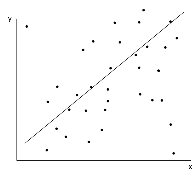
Eyeballing the line, unlike using OLS, does not allow you to perform tests of statistical significance. You do not get to find out whether the relationship could have occurred by random chance. And as we’ve seen, these tests of statistical significance come from a very reasonable theorem that we can test ourselves—the central limit theorem. There are some leaps of faith that you are asked to do here, like assuming that multiple linear regression really works and has this magical property of controlling for observable confounders.
The answer to the question in the image description will be left for the next post. But in short, even if you don’t know everything about how a relationship works, like how F = MA, a naive linear regression can still identify causal effects if the variable of interest is exogenous, unrelated to other things that affect the outcome.
But what I really hope you’ve learned is that the explanations are out there, even if they’re difficult. Too often, people assume that if something economists or other scientists say doesn’t make sense on first impression, they have no explanation for it and the field is bunk, or that bullshit is hidden behind a veil of mathematics. You should instead assume that if the experts appear wrong, they have an explanation you haven’t seen. Sometimes, the explanations are genuinely hard, because thinking is hard.
Combined with instrumental variables and other quasi-experimental techniques, econometrics is more convincing than it might appear at first glance. We can, for example, use rainfall as an instrumental variable for the number of protestors in an area, and discover that protests really do help a political cause. Rainfall appears to be “random” in a certain sense, i.e. unrelated to the success of a political movement. It’s like a drug randomly assigned to parts of the country that depresses their political movements.
These methods are not perfect. To criticize this point about protests, you might point to this paper showing large numbers of potential violations of the exclusion restriction, meaning rainfall could influence political outcomes through other variables, invalidating the results. But the point is not that you should substitute skepticism for a statistical form of faith. Methods like those described here should inform you without making you completely certain.
One method of analysis that will be explored somewhat in the next post is Bayes’ Theorem. This mathematical result allows you to find the probability that something is true given that you observed some evidence for it, using something called a “Bayesian prior”. Importantly, it suggests that when seeing evidence, you should move from a prior belief about the world (“I am 50% confident that immigrants depress wages”) to a different one (“I am 49% confident that immigrants depress wages”). Even a limited form of evidence should have this effect on you. Troublingly, most people are only exposed to forms of evidence that push them in the direction they want to go, gaining more and more confidence that they’re right. Again, a better way to summarize evidence will be discussed in the next post.
The essential problem of believing economics is not a science is not that it’s wholly wrong to believe it’s not a science, but that it suggests ignorance as a proper substitute. Usually, “economics is not a science” is an excuse to advocate for policies the weight of evidence does not favor, like rent control, immigration restrictions, and the repeal of congestion pricing. Knowing econometrics allows you to understand that evidence, and understanding the world is the first step toward making it better.
This is a joke. Please show humility and listen to people even when it’s hard to believe they have anything meaningful to tell you.
A term for omitted variables that create bias.
A previous version erroneously referred to selection bias as sampling bias. Thank you to Substack user Liam Baldwin for pointing this out.
Even having mostly solved this person’s problem, they still said the following: “The supply and demand curves of neoclassical microeconomics is a flimflam to dress up a very common place observation known since antiquity, that in times of shortage, prices will rise and in times of glut, they'll fall. [Emphasis is their own.] This was a fact known to all classical economists like Smith, Ricardo, Malthus, William Petty, Tooke, JS Mill etc., including Marx. Nothing testable is added by claiming that these curves exist. They are non-operational, and do not correspond to the basic criteria of validity as laid out by the German mathematician Leibniz.”
These curves are indeed testable, though only to people who have taken a class like Econometrics II at the LSE, or read about econometrics. Here is a more complete explanation I skimmed. It’s not clear to me what the “criteria of validity” refers to, probably because I haven’t studied the ideas of Leibniz. A cursory search and a ChatGPT query didn’t help, so I can’t address that part. Considering the behavior of this user, I might be looking for an apple in a void.
Assuming I’m not, they might mean his principle of contradiction. If observed quantities and prices are consistent with multiple sets of supply and demand curves, and a single observation of quantity and price is the best we can do, then the model contradicts itself. This falls apart pretty quickly through what I’ve described so far. In case you’re unfamiliar with Leibniz, he was not a crank who got cited here for his embrace of woo-woo. He helped create calculus alongside Isaac Newton.
Calculus involves things called functions. These are just rules that tell you to associate one thing with another by taking one thing as an “input” and another as an “output.” Usually we write a function like this:
f(x) = 2x
This function takes any number x as an input, multiplies it by 2, and gives that as an output. Think of it like this: x goes into the hole on the left, and whatever is on the right tells you what it turns into. So:
f(2) = 2*2 = 4
Another way to write a function like this is x ↦ 2x. We can also talk about more interesting functions like the squaring function:
g(x) = x2
This takes any number as an input and squares it.
In the section on ordinary least squares, we did something called minimization, treating a sum as a function of our estimate. The minimum of the squaring function is easy to see in a graph (or guess).
The minimum occurs when x = 0. Obviously, if you multiply any number other than 0 by itself, it will be greater than 0. This example allows us to see how the general method for minimizing a function works.
We’ll need something called the derivative, which tells you the slope of a function at a point. (This is not quite true, but I’d like this to be easy to understand.) In the graph, the slope is very negative at the leftmost point, and there’s no slope at the minimum. That’s not a coincidence. If a function is defined for all real numbers and is always differentiable, then if it has a minimum, it must occur at a point where the derivative is zero.
It may not be obvious why this is the case, so I’ll elaborate. Let’s assume we have some function where this isn’t true. You have a minimum point, and the slope isn’t zero there. Because the slope isn’t zero there, you can decrease the output of the function by increasing or decreasing the input, whichever works. (If the slope is negative, simply increase the input to get a lower output.) So the point we’ve imagined couldn’t possibly be a minimum. We know that we can change the input in the way described because this function is defined for all real numbers, including those very close to our imagined point. The slightly more general version of this idea is called the interior extremum theorem.
The derivative of g(x) is usually written g’(x). In this case, g’(x) = 2x. To get this derivative, we multiply x by the exponent and then subtract 1 from the exponent. That’s the essence of the power rule used for finding derivatives, though you may find it difficult to generalize with this simple example. Notice how 2*x is negative when x is negative, zero when x is zero, and positive when x is positive. Likewise, the slope of the line in the graph is negative when x is negative, zero when x is zero, and positive when x is positive.
The derivative of g(x) is more specifically a derivative with respect to x. That means it describes how the function changes as you change x, the only input. Other functions can take multiple inputs, like the sum I gave. We used the derivatives with respect to bo and b1.
What I’ve described so far is sufficient to make the ordinary least squares derivation fairly convincing. The formulas I gave supposedly described the derivatives with respect to b0 and b1. If you wanted to, you could take some data, calculate different sums with different values of b0, and graph them. Then you could see if the derivative I gave really seems to describe the slope at different values of b0. If you aren’t fully convinced, you should take to Google and find explanations of the power rule and the chain rule, both used in the derivations of the sum with respect to b0 and b1.
It is very, very annoying that the formatting on characters with a bar like “X̄” makes them indiscernible and/or ugly.
If you can’t tell, I’m choosing not to do a proof of unbiasedness here because I’m lazy and I figure you trust this part anyway. If you really want a proof that this is a nice estimator, look up “proof that the standard error is unbiased” and get looking.
I should mention that two-way causation and omitted variable bias are both a form of “endogeneity”, which refers to any case where the error term in the regression is correlated with one of the variables we included in the regression. It’s clear how this applies to omitted variable bias. With two-way causation, Y has some causal effect on X, and because Y is itself affected by the error term, the error term affects X through Y. That means they are correlated, and endogeneity is the result.
In general, we prefer for the variables we’re interested in to be such that E[ e | X ] = 0. This means “the expected value of the error term, given any value of X, is zero.” When this is true, we say that X is exogenous, rather than endogenous. I like to think of this as a general condition for causality: if something, X, is correlated with something else, Y, and it is not related to anything else that could affect Y, then X has a causal relationship with Y. But causality is not exactly a resolved issue in science.
Vulpes vulpes? Really? You named the fox “fox fox”?
Note that it’s not true that you must pay the full beer tax. Even if the tax is imposed on you at the point of sale, some of it is implicitly paid by the business as well. In a nutshell, this is because businesses simply cannot charge the same price as they did before, plus tax, and still expect to sell all of their units. (After all, if beer is more expensive, people will buy less of it—that’s how beer taxes reduce traffic fatalities.) So businesses have to cut prices, implicitly paying some of the tax themselves.
In general, tax burdens depend on the relative elasticities of supply and demand. That means how responsive suppliers are to price changes compared to consumers. If, for example, a tax is imposed on insulin producers, insulin buyers pay the full price. It’s an absolute necessity, so their demand is perfectly inelastic, meaning unresponsive to price changes. Thus, insulin producers can raise prices to compensate for the tax.
All of this can be seen if you draw the tax increase as a supply shift (or a demand shift!) with a standard supply and demand graph. Instructions for how to do this can be found online, or by emailing me at jw2970a@american.edu.
“wait what is Euler’s number anyway” I DON’T KNOW PLEASE DON’T ASK
The previous footnote was a joke. One way to describe Euler’s number is that it is the number such that the derivative of its exponential function (e^x) is itself. Hypothetically, you could discover it by estimating derivatives for lots of different exponential functions (e.g. 2^x) and then noticing what happens when you go near 2.72. The actual story is boring and involves compound interest.
By the time I got to editing this part and wrote this title I was very tired.
These instructions are intuitive but logically imperfect. Taken literally, you would be stuck on the second loop forever, removing the second period and backtesting over and over again. But if I had instead written something like this:
1. Set t = 0
2. Remove period t+1
3. Estimate model using remaining periods
4. Attempt to predict growth in period t, record result
5. Return to step 2
most readers would find the instructions less clear.
I am very impressed with the amount of effort that went into this. Maybe I'll get around to reading it once the job market forces me to finally realize theory is out and the future is applied. Till then... my whiteboard is my best friend.
> “Sample bias is simply any bias in the collection of the sample of people or entities used in the sample. For example, the people we’re measuring might self-select into the sample by choosing to participate in a way that relates to the outcome. Think of a new program a teacher introduces to help students do better on tests. People self-select into the program, and what do you know, they do better than the people who don’t!”
It may be useful to make the distinction between Sampling Bias and Selection Bias. It is different to say the sample we study is non-representative (not randomly sampled), than to say individuals non-randomly select into the treatment group. Of course, they are similar problems, but Sampling Bias does not bias the estimated effect, though it may constrain us to finding a local treatment effect. In the example of Bleemer & Mehta, UCSC is not a random sample of college students, but this does not bias their estimates because Selection Bias is (probably) not present in sufficiently small intervals around the GPA cutoff. In other words: Selection Bias threatens Internal Validity, while Sampling Bias threatens External Validity.
Also, how long did it take you to write this? It’s quite good.